Custom professional website
Project Overview
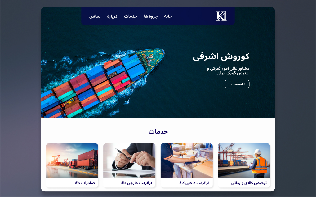
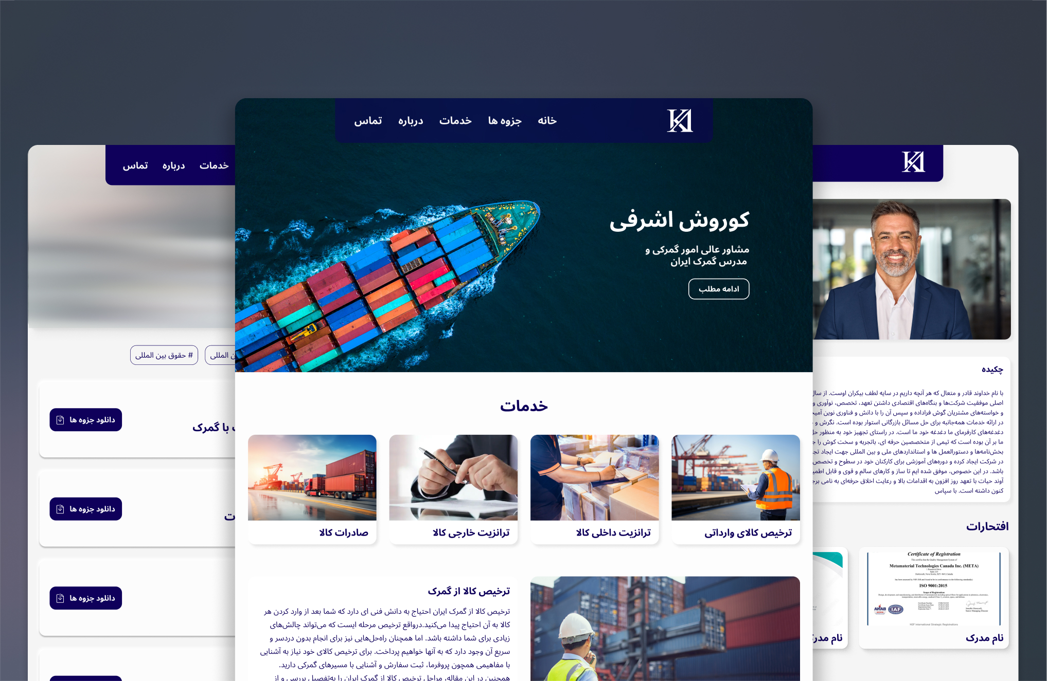
Kourosh Ashrafi is a comprehensive website project built for a customs consultant and university professor, Kourosh Ashrafi. The objective was to create a minimalistic and semi-corporate platform to present his services and provide students with easy access to course documents and lecture slides. The website features a home, about, contact, blog, and documents page, all in Farsi, a right-to-left (RTL) language. This project was a collaborative effort with another designer-developer.
Technologies Used:
Figma
HTML
CSS
JavaScript
Asana
Members and Role:
Kimia Ahrafi
- UX-UI Designer

Amir reza Sadeghi
- Developer

Amir kian Ashrafi
- Project manager
Problem Statement:
Kourosh Ashrafi, a customs consultant and university professor, needed a professional online platform to present his services and provide his students with easy access to course materials. The website had to be user-friendly, visually appealing, and fully functional in Farsi (RTL).
Solution Statement:
We designed a minimalistic and semi-corporate website that effectively presents Kourosh Ashrafi's services, provides students with easy access to lecture slides, and ensures a seamless user experience. The design focused on clarity, usability, and accessibility, incorporating feedback from user testing to refine the final product.
Research & Analysis
We began by understanding the client's goals and requirements through several online meetings. Kourosh Ashrafi wanted a website that was clean, minimal, and focused on essential information. He emphasized avoiding unnecessary animations and extra content to maintain a professional and straightforward aesthetic.
Given the website's target audience of students and professionals, we researched standard practices in educational and professional website designs. Additionally, we identified the technical challenges associated with supporting Farsi, an RTL language, and began exploring solutions.
Challenges and Solutions
Language Difference:
One of the significant challenges was the RTL support for Farsi. Many plugins do not support RTL languages, so we had to customize plugins or write our own jQuery code to ensure proper functionality.
Client’s Limited Technical Knowledge:
Another challenge was the client's limited technical knowledge, which required us to have multiple meetings to explain our design choices and the rationale behind them. To facilitate smoother communication, we provided crash courses in Figma and VSCode for the client, enabling him to better understand the design process and provide more informed feedback.
Wireframing and Initial Designs:
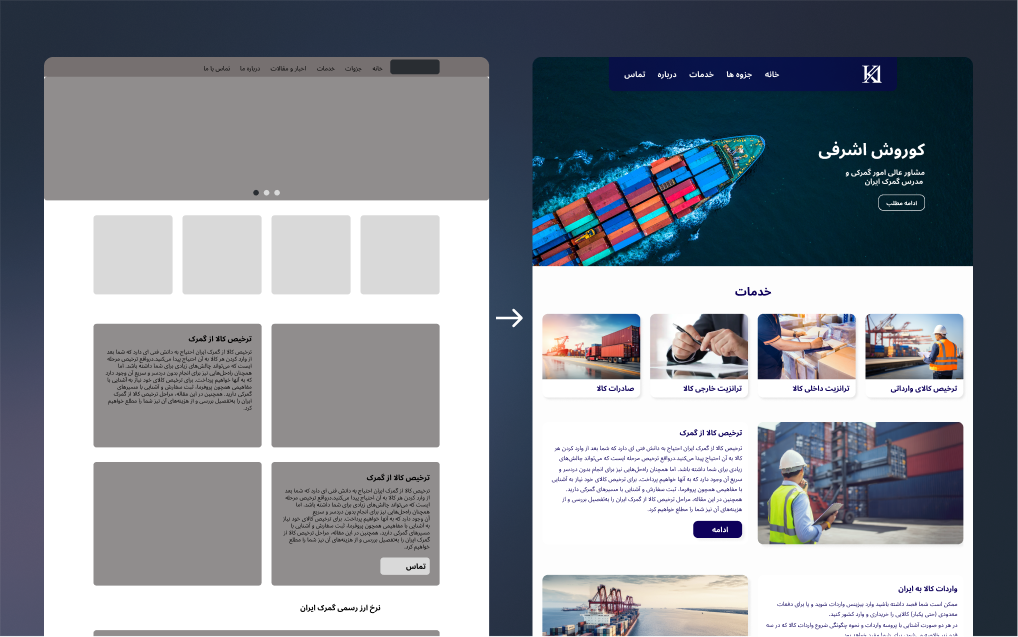
Using Figma, we developed wireframes and initial designs for the website. These wireframes were reviewed and refined based on the client's feedback to ensure they aligned with his vision and requirements.
User Testing and Iteration:
The documents page, where students download lecture slides, was a critical feature. We designed multiple versions of this page and tested them with several students to gather their feedback. The testing sessions helped us understand what users liked, disliked, and what improvements were needed.
Based on the feedback, we iterated on the design, combining user insights with standard practices in Learning Management System (LMS) designs. The final version of the documents page was tailored to the client's needs and optimized for a smooth user experience.
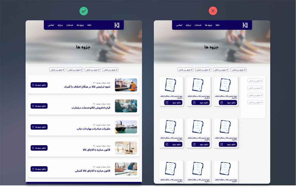
I also created a short video walkthrough of the downloading process to demonstrate its ease of use and ensure it met the client's and students' expectations.
Page Walkthrough
Home Page:
The homepage serves as a summary of the entire website, introducing Kourosh Ashrafi and presenting his services. It features the latest blog posts, crucial customs laws updates, and the latest exchange rates, ensuring users have access to essential and updated information. The layout is designed for easy navigation and immediate engagement.

Services Page:
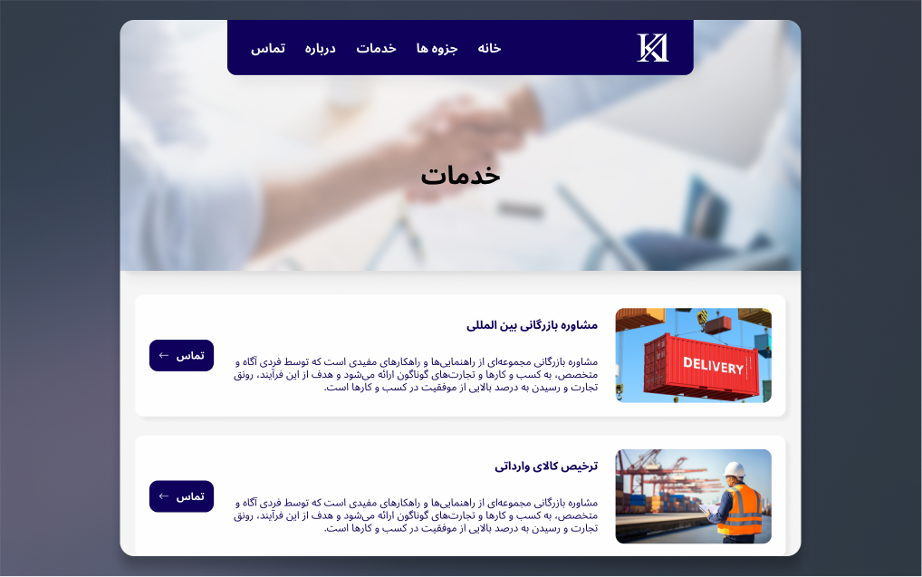
This page showcases all the services provided by Kourosh Ashrafi, explaining the steps and setting clear expectations for the users. It is structured to guide users through the available services seamlessly, enhancing the user journey and providing clarity.
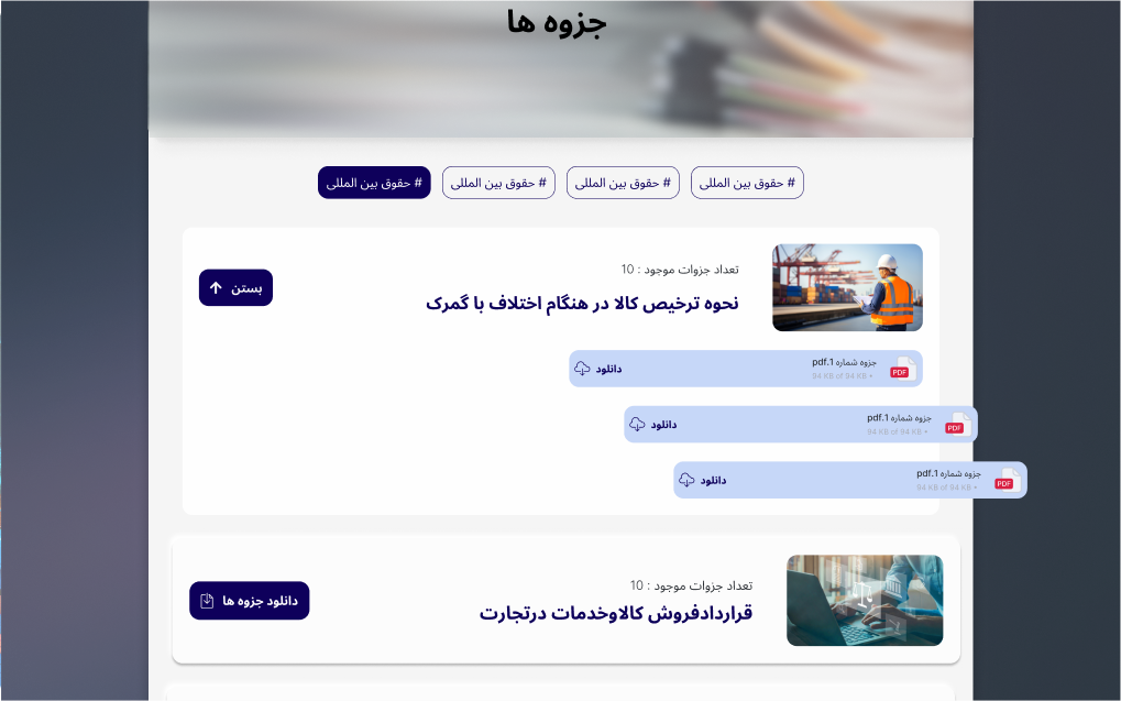
Lecture Slides Page:
A key page for Mr. Ashrafi's students, it allows easy downloading of lecture slides and course content. The design is user-centered, ensuring that students can find and download their desired slides with minimal clicks. We tested multiple design concepts and finalized the layout based on client and user feedback, ensuring optimal usability and accessibility.
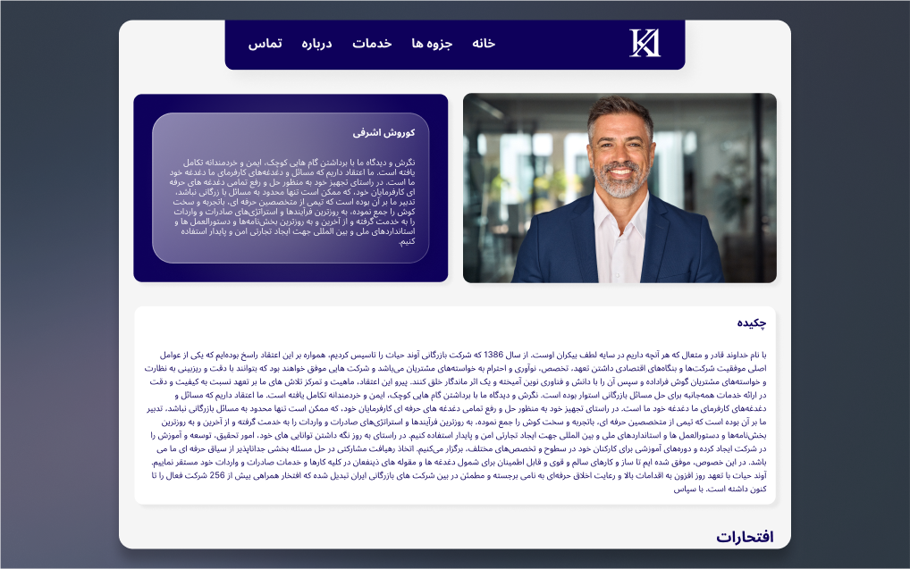
About Page:
Containing comprehensive information about the client, this page includes his biography, experiences, certifications, and companies he has worked with. The design aims to enhance the client's credibility and present his professional background effectively, using a clean and organized layout.
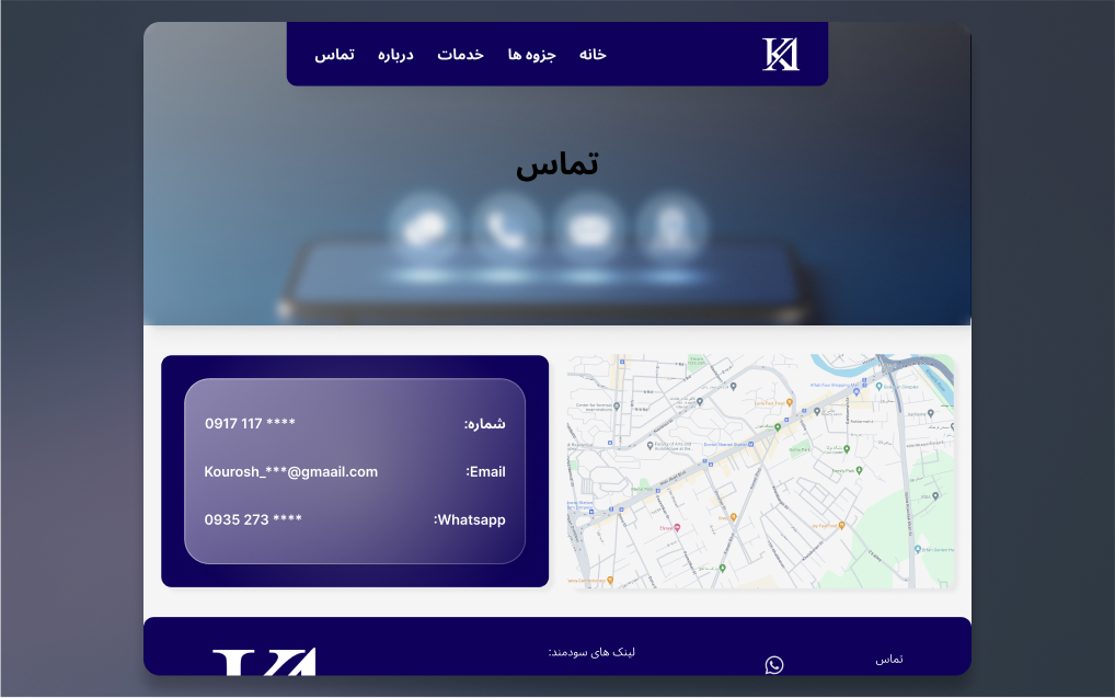
Contact Page:
Providing all available contact information, this page includes the client's office address, phone number, email, Telegram, and WhatsApp details. These are some of the most common communication platforms in Iran, making it easy for users to connect with the client.
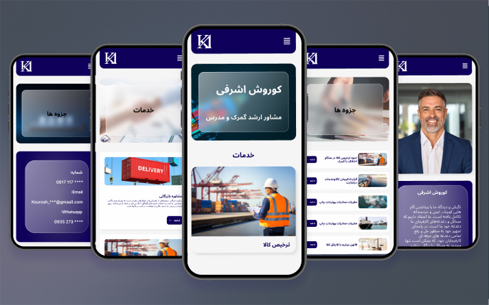
Responsiveness
Additionally, we ensured the page was responsive and functioned seamlessly on both desktop and mobile devices. The final design effectively balances functionality and simplicity, making it easy for students to access the materials they need.
Conclusion
The Kourosh Ashrafi project was a collaborative effort to create a functional and aesthetically pleasing website that met the specific needs of the client and his students. By prioritizing user research and iterative design, we developed a platform that facilitates easy access to course materials while maintaining a minimal and professional look. The project's success is evident in the seamless user experience and the client's satisfaction with the final product.
Kourosh Ashrafi
“Kimia's expertise transformed our vision into a stunning, functional website that perfectly caters to our academic and consultancy needs. Her innovative approach to design and attention to detail, especially in creating a seamless bilingual interface, exceeded our expectations.”
