Real Estate App Design
Project Overview
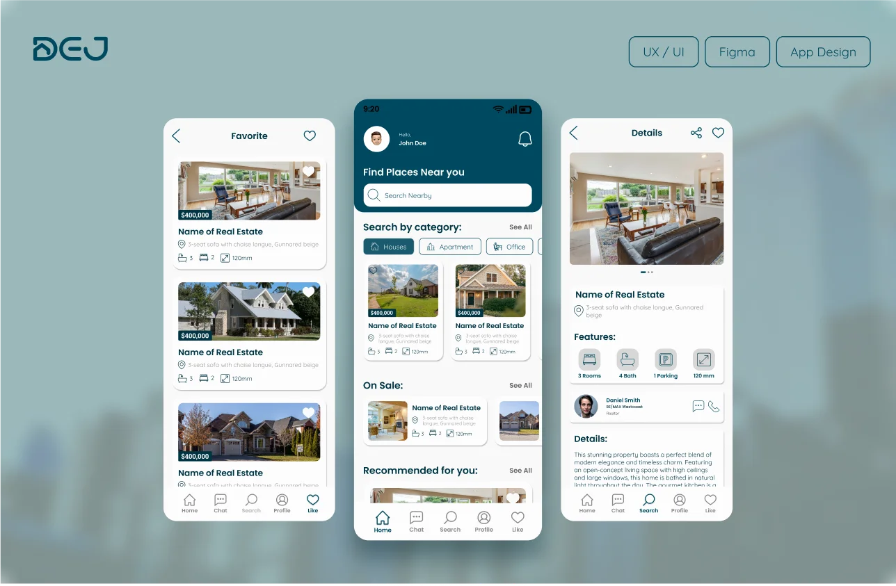
The design for the real estate mobile application aims to create a user-friendly platform that simplifies property search and management for both renters/buyers and owners/realtors. The objective is to provide an intuitive interface where users can access extensive listings, receive personalized recommendations, and efficiently manage their real estate needs.
Technologies Used:
Figma

Adobe creative cloud

Android Studio
Problems Identified
- Limited Listings: Users often struggle with finding suitable properties due to insufficient listings on traditional platforms.
- Complex Navigation:Complex Navigation: The real estate market can be overwhelming and confusing, especially for new users.
- Disjointed Communication: Users need to use multiple apps for communication and scheduling with property owners or realtors.
- Outdated Information: Listings may lack up-to-date information, leading to wasted time and frustration.
Solutions Provided
- Extensive Listings: The app offers a comprehensive range of property listings, providing users with numerous options.
- User-Friendly Interface:An intuitive design guides users through a streamlined search process, helping refine search criteria and find relevant listings easily.
- Updated Information:Ensuring property listings are constantly updated with the latest details, including availability and pricing.
- Integrated Communication:Allowing realtors to set meetings and viewing appointments directly through the app, eliminating the need for additional apps. This approach leverages key UI/UX principles such as user-centered design, acc
Work Process
My work process focused on deeply understanding user needs and challenges through various research methods, generating creative solutions, and iterating designs based on user feedback.
- Empathize
- Competitor Analysis
- User Stories
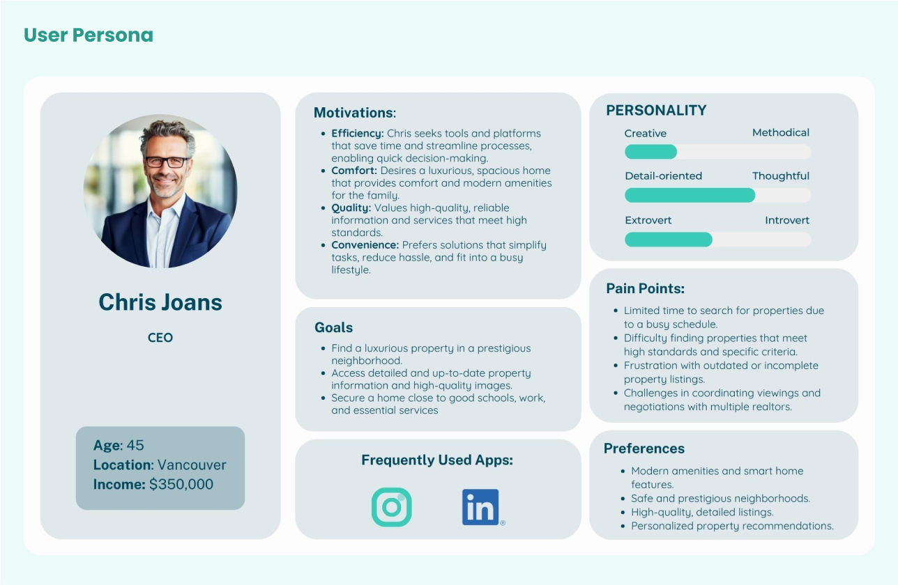
- User Persona
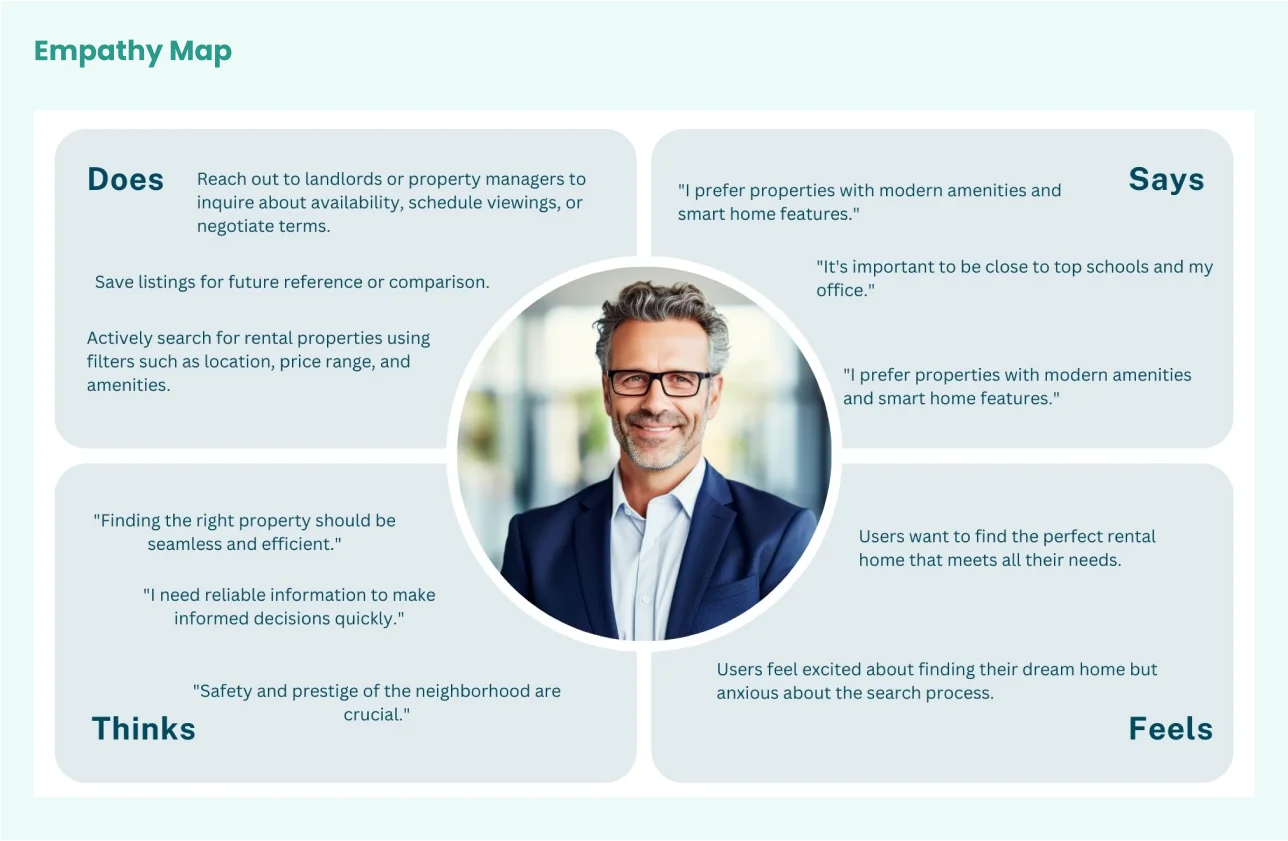
- Empathy Map
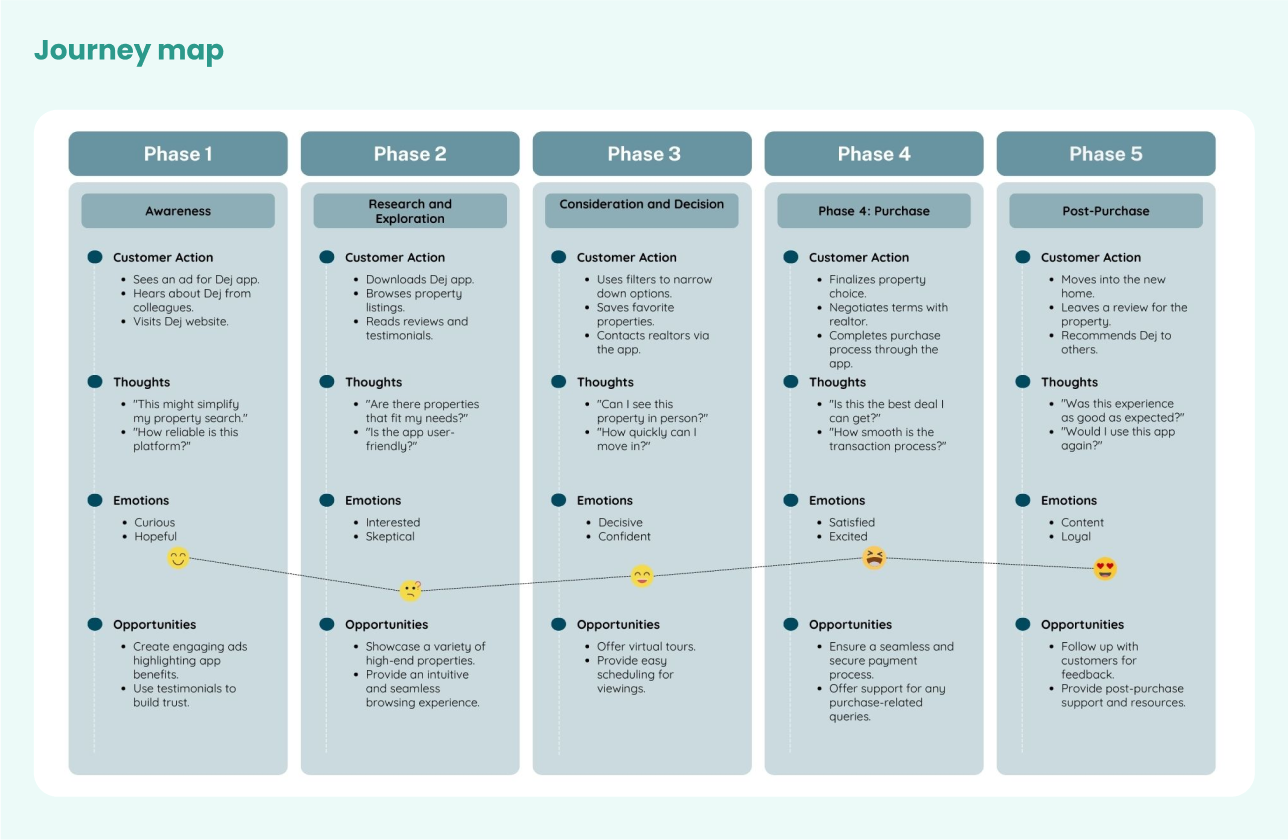
- Journey map
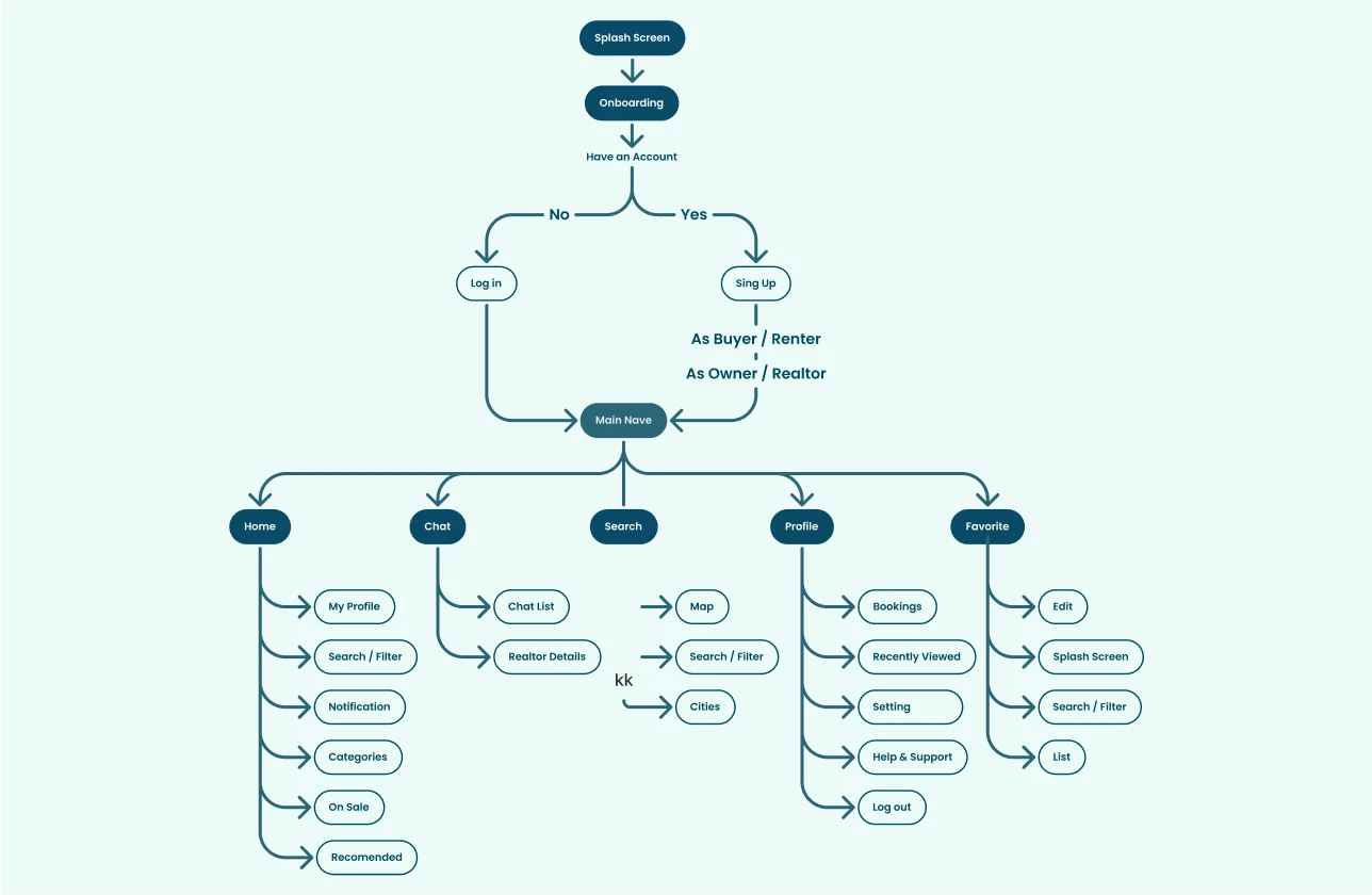
- User Flow
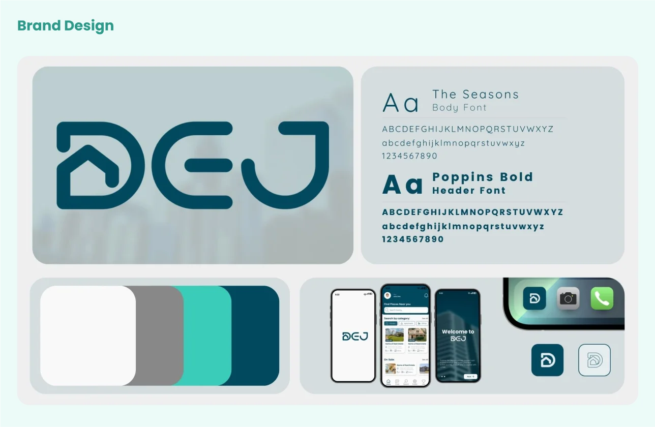
- Brand Design and Design System
- Component Creation
- High Fidelity Wireframes
- Usability Testing
- Iterating Based on Feedback
Screens Walkthrough
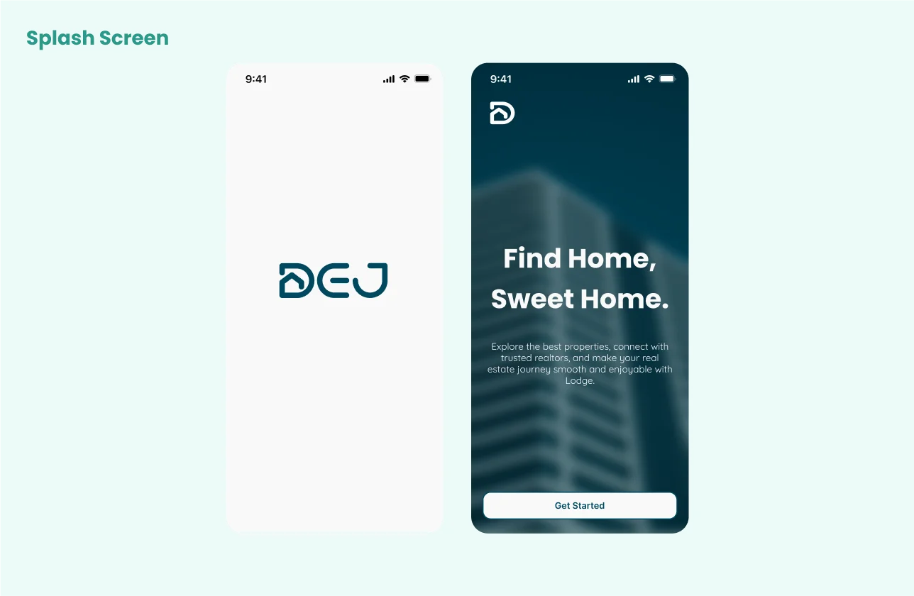
Onboarding Screens
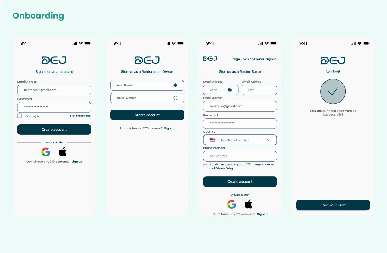
The onboarding screens provide users with a seamless and intuitive experience, ensuring they feel comfortable and confident using the app from the outset.
Authentication Screens
The onboarding screens provide users with a seamless and intuitive experience, ensuring they feel comfortable and confident using the app from the outset.
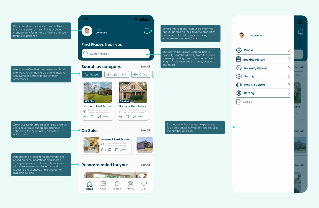
Home Screen
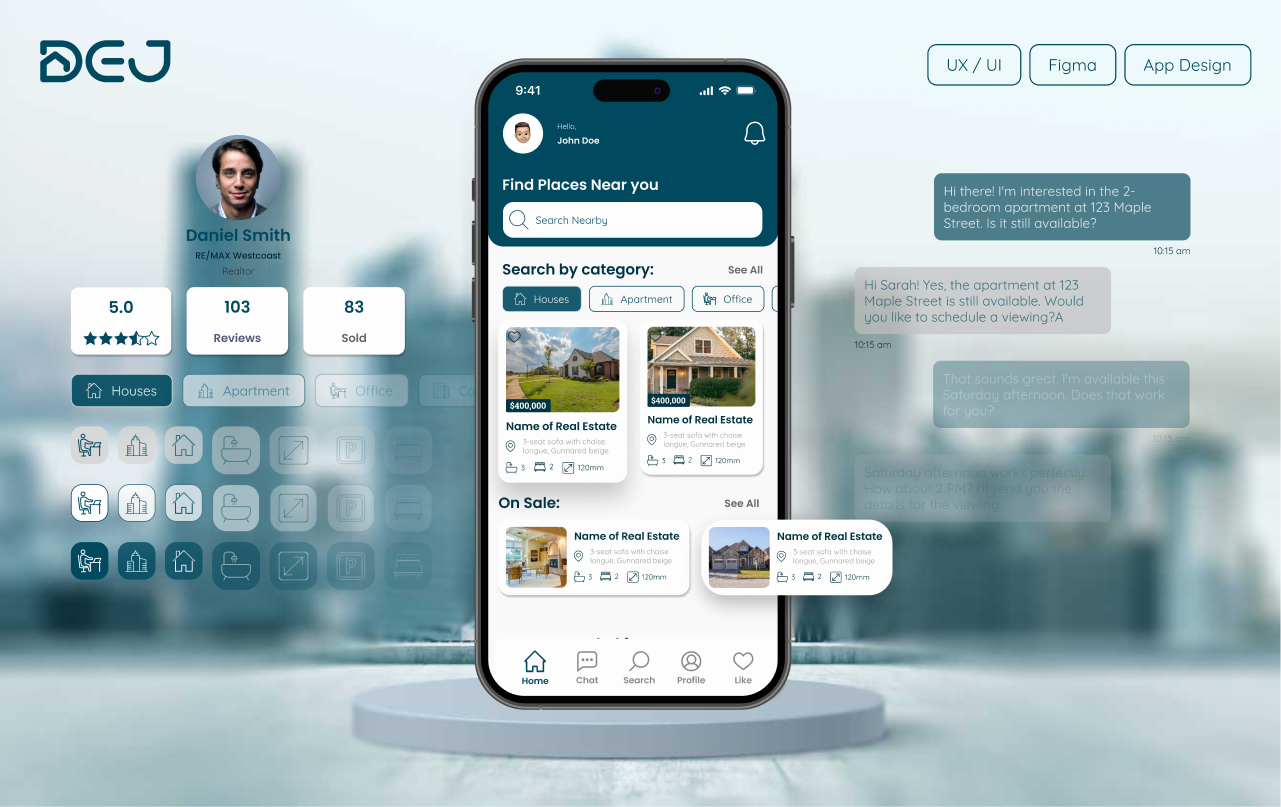
The home screen serves as the central hub where users can access key features and navigate various aspects of the platform.
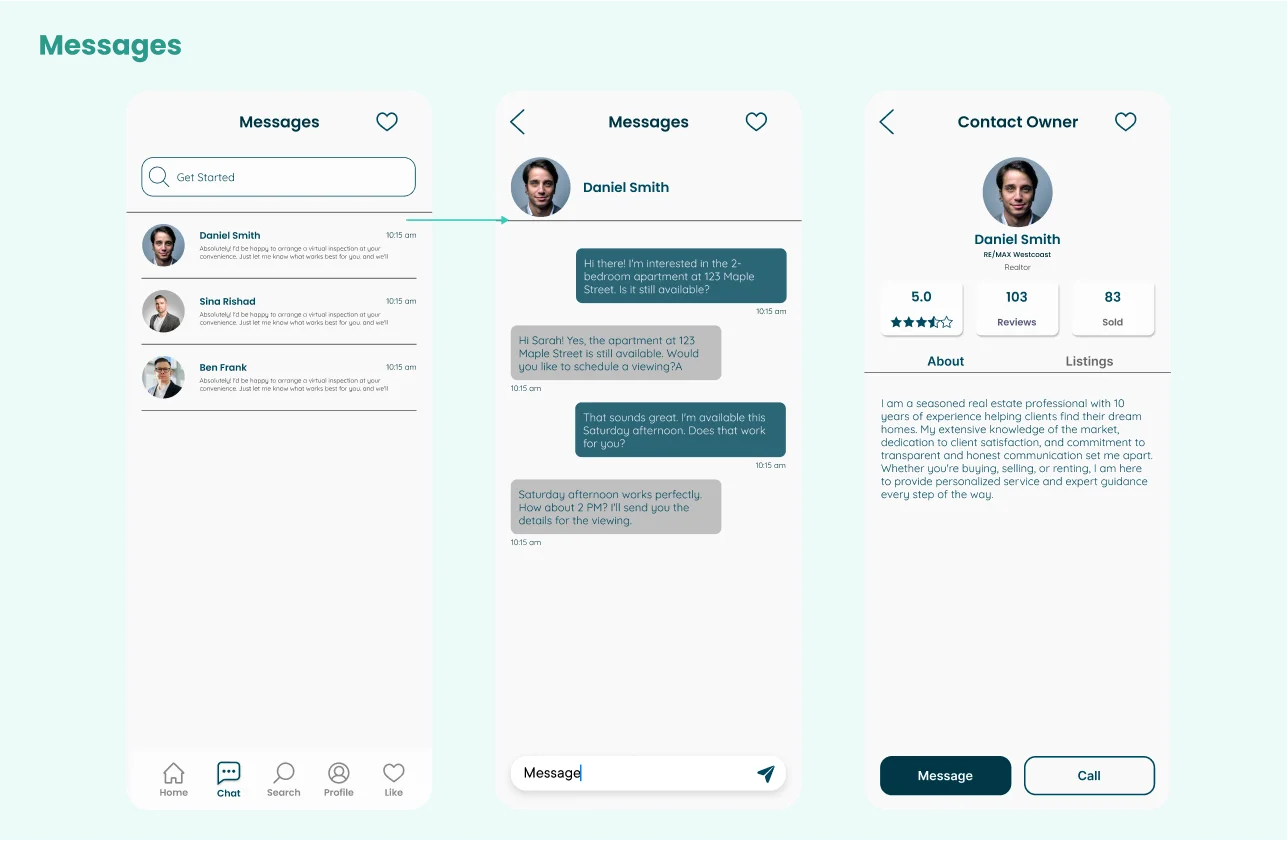
Messages Screen
The Messages screen facilitates seamless and secure communication between users and property managers, allowing users to ask questions, schedule viewings, and negotiate terms.
Search Screen
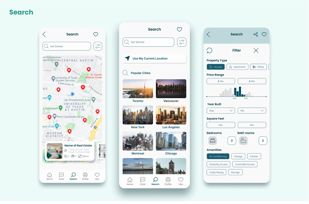
The search screen enables users to find properties based on their current location, apply detailed filtering options to narrow results, or search in specific cities to find properties that match their needs.
Showcase Screen
The showcase screen provides detailed information about a property and its owner/realtor, including property images, features, price, and the ability to share or save the property into favorites. Users can also contact the owner/realtor directly or learn more about them.

Conclusion
The Kourosh Ashrafi project was a collaborative effort to create a functional and aesthetically pleasing website that met the specific needs of the client and his students. By prioritizing user research and iterative design, we developed a platform that facilitates easy access to course materials while maintaining a minimal and professional look. The project's success is evident in the seamless user experience and the client's satisfaction with the final product.

