Arazman Jewelry UX Research
Project Overview
Arazman is a UX/UI design project focused on creating a seamless user experience for a business management web application tailored to small to medium-sized enterprises (SMEs). The main objective was to streamline business processes such as project management, inventory tracking, and financial reporting. This project emphasized user research, testing, and iteration to ensure an intuitive and efficient user flow. Designed in Figma, Arazman involved extensive user testing and feedback loops to refine the interface and enhance usability, aiming to provide SMEs with an optimal digital tool for managing their operations.
Technologies Used:
Figma

Maze

Canva
Monday
Members and Role:
Kimia Ahrafi
- UX-UI Designer
Research & Analysis
The journey began with in-depth user research and competitive analysis. We dove into interviews and surveys to uncover the preferences and pain points of our target demographic. This research phase was pivotal, revealing that users prioritize easy navigation and detailed product information.
We didn't stop there; we also examined top jewelry websites to understand industry standards and best practices. This competitive analysis provided a solid foundation for our design strategy, helping us identify opportunities for innovation and improvement.
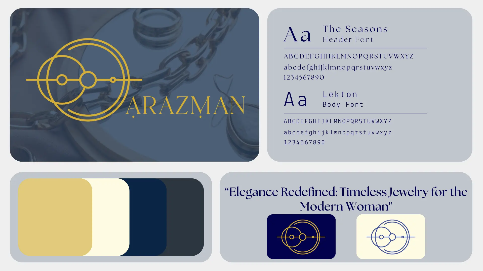
Brand Design & Identity:
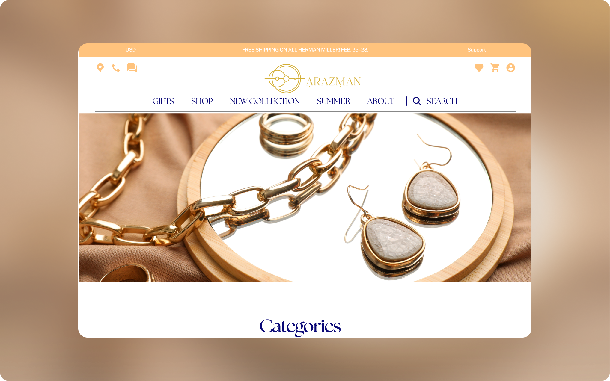
With a clear understanding of our users, we set out to create a brand identity that resonated with our audience. The goal was to develop a visual design that reflected the elegance and sophistication of the jewelry while ensuring it was approachable and user-friendly. This step was crucial in building trust and enhancing the overall user experience.
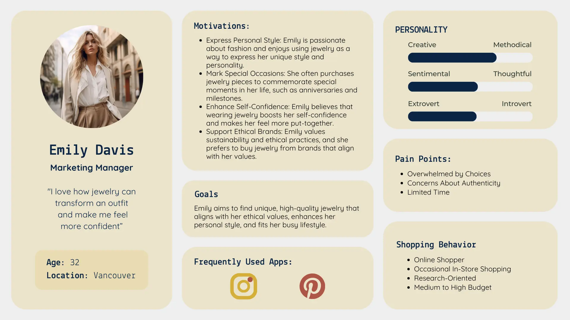
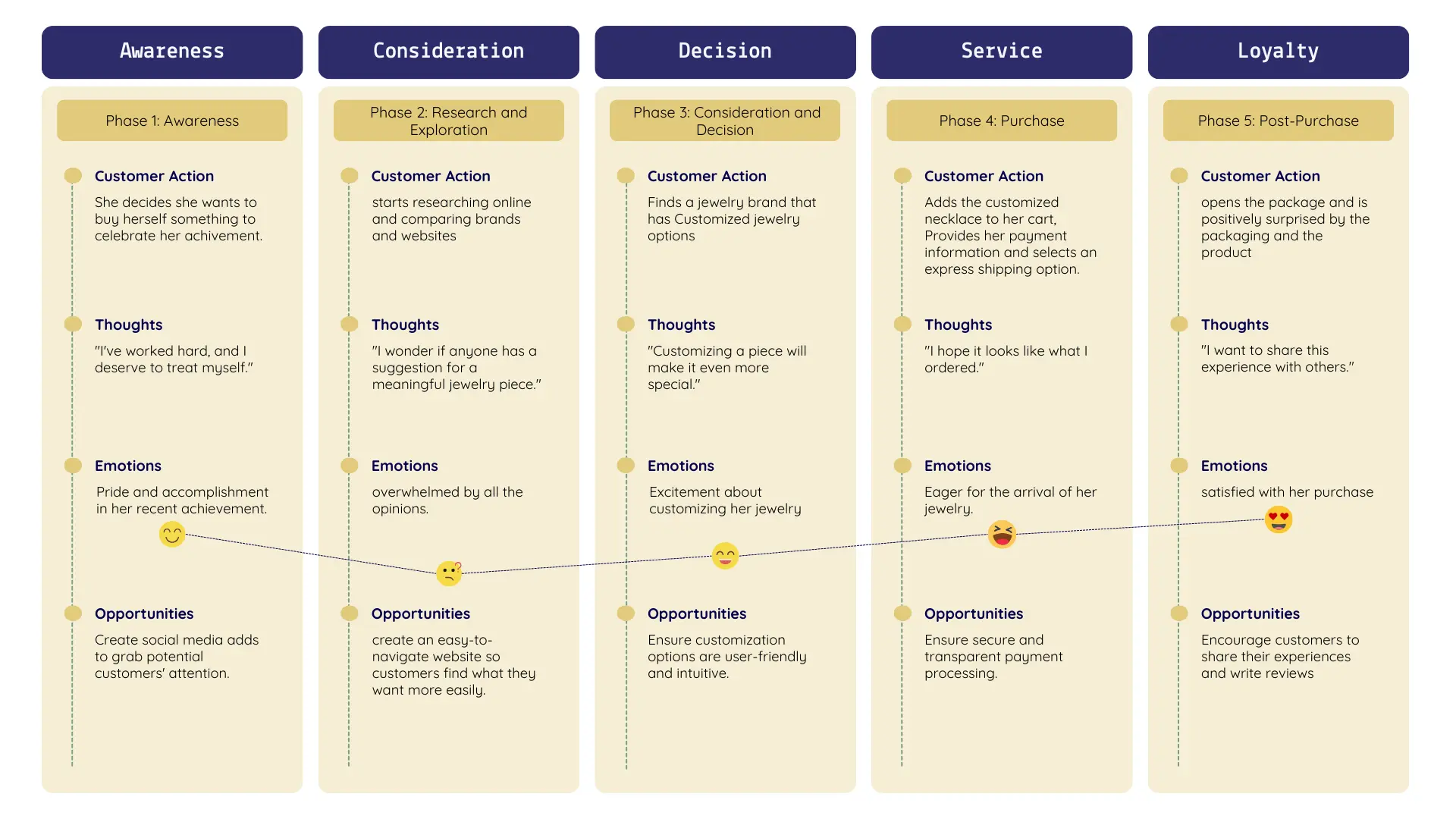
User Personas and Journey:
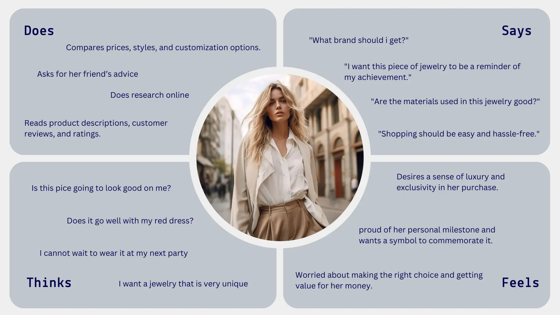
Next, we created detailed user personas, representing our target audience. These personas were essential in guiding our design decisions, ensuring we stayed focused on user needs throughout the process. We also developed empathy maps to gain deeper insights into user motivations and frustrations.
Mapping out the user journey was the next critical step. We identified key touchpoints and interactions, creating a user flow diagram to ensure a seamless purchasing path. This comprehensive approach allowed us to visualize the user's experience from start to finish, highlighting opportunities to enhance their journey.
Persona, Empathy Map, Journey Map
Wireframes & Prototyping:
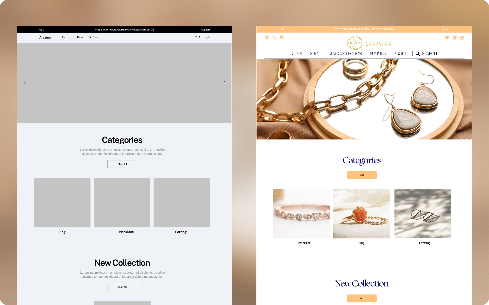
With our research and user insights in hand, we began designing the wireframes. Starting with low-fidelity wireframes, we focused on the layout and structure, prioritizing user-friendly navigation and clear product presentation.
Once the low-fidelity wireframes were approved, we moved on to high-fidelity wireframes. This phase involved adding detailed design elements and creating an interactive prototype. The high-fidelity prototype brought our vision to life, allowing us to visualize the user journey in a realistic and engaging way.
Low-Fidelity to High-Fidelity

User Testing
Maze:
To ensure my design met user expectations, I conducted usability testing using Maze. I gathered a group of 10 participants who matched our target demographic and had them interact with the prototype. Analyzing the data from these tests provided valuable insights into usability issues and areas for improvement.
Maze Result:
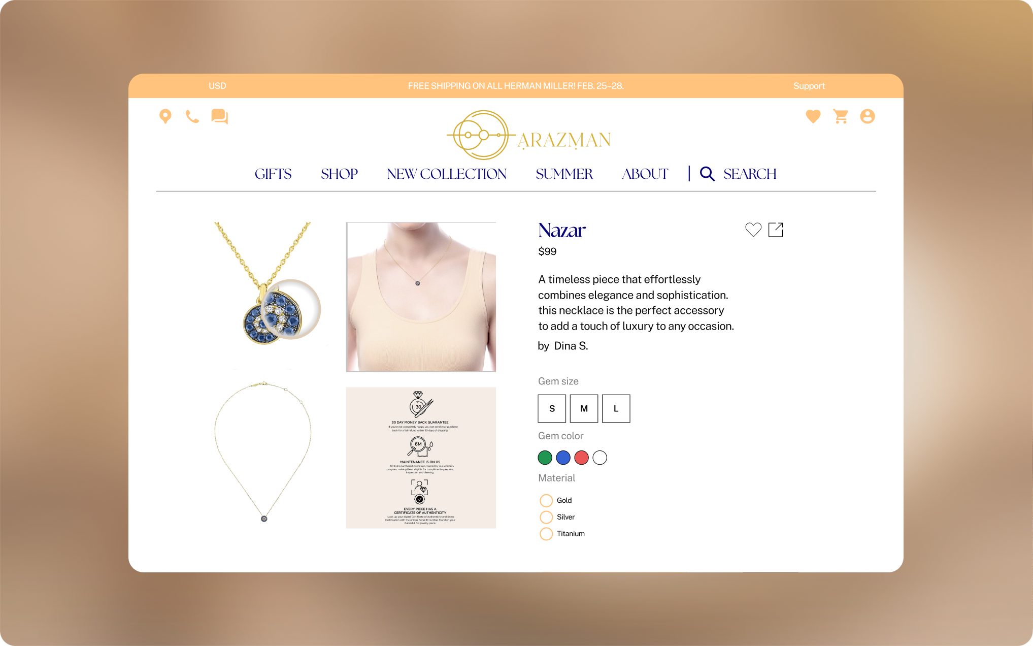
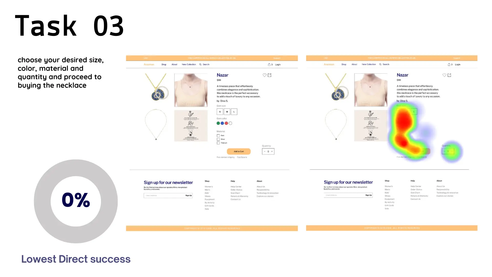
One of the tasks with the lowest success rate was task number 3: "Choose your desired size, color, material, and quantity and proceed to buying the necklace" which had a success rate of 0%.
Upon reviewing the steps each user took, we realized that the use of checkboxes caused confusion. Users were unsure why they could select multiple colors and materials for a single necklace and how that would work.
This ensures that students can quickly access their materials without any hassle.
Iteration and Final Design
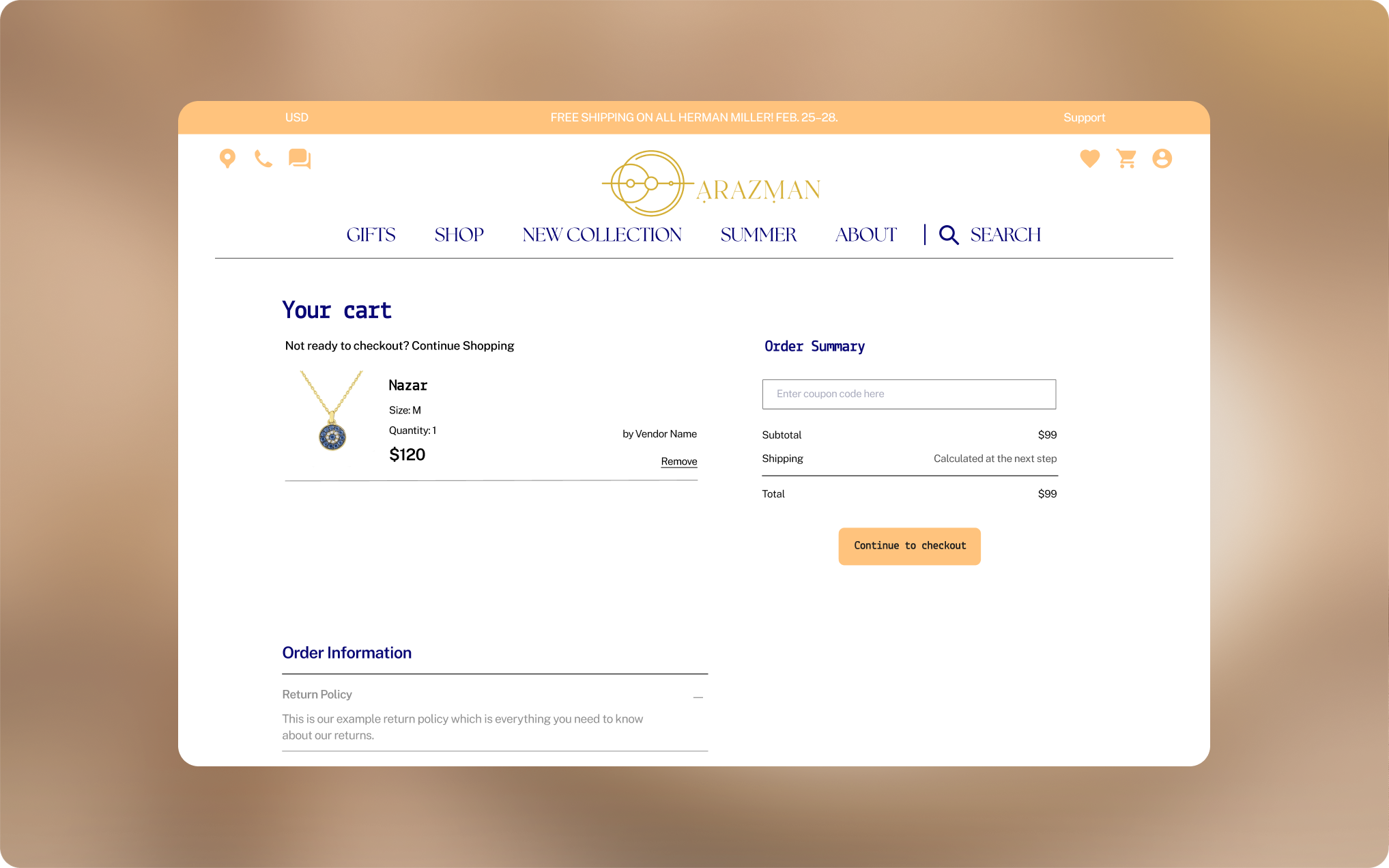
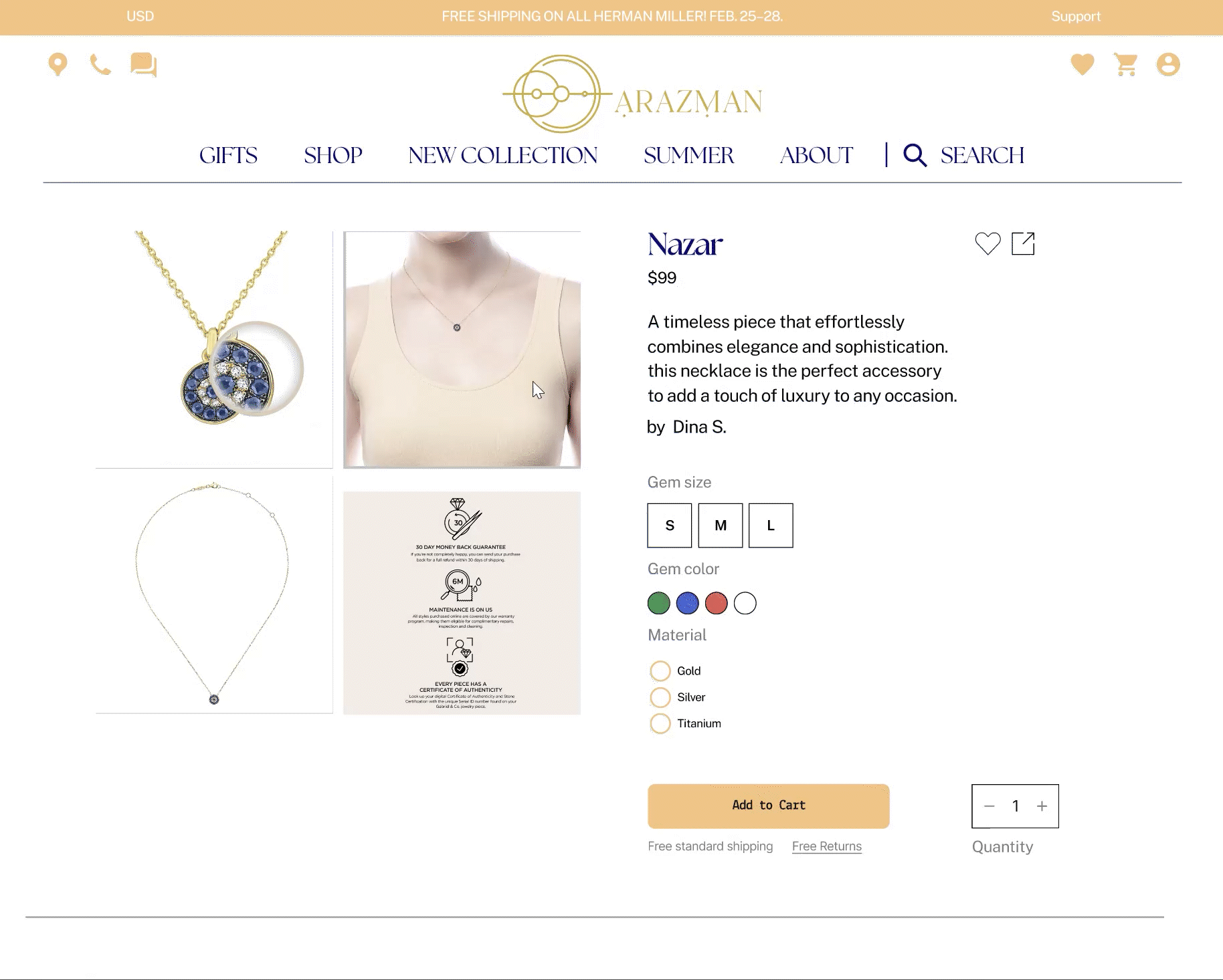
Based on the feedback from the usability testing, we made significant iterations. Specifically, we replaced the checkboxes with radio buttons to allow only one selection at a time. Additionally, we added a feature where increasing the quantity from 1 to a higher number enabled users to choose the size, color, and material for each additional item separately. These changes drastically increased the success rate for this task from 0% to 95%.
This iterative process was crucial in refining the user experience and ensuring the final product was intuitive and engaging.
Conclusion
The Arazman project was a journey of discovery and innovation. By prioritizing user research and incorporating user feedback, we were able to create a prototype that not only met but exceeded user expectations. The final design showcases a seamless and intuitive user journey, providing a high-quality experience for purchasing jewelry online. Our commitment to understanding user behavior and iterating based on feedback led to a significant improvement in task success rates and overall user satisfaction.
Other Project
UX-UI . Developement
Redesign of a premium bakery website, focused on user interactivity.
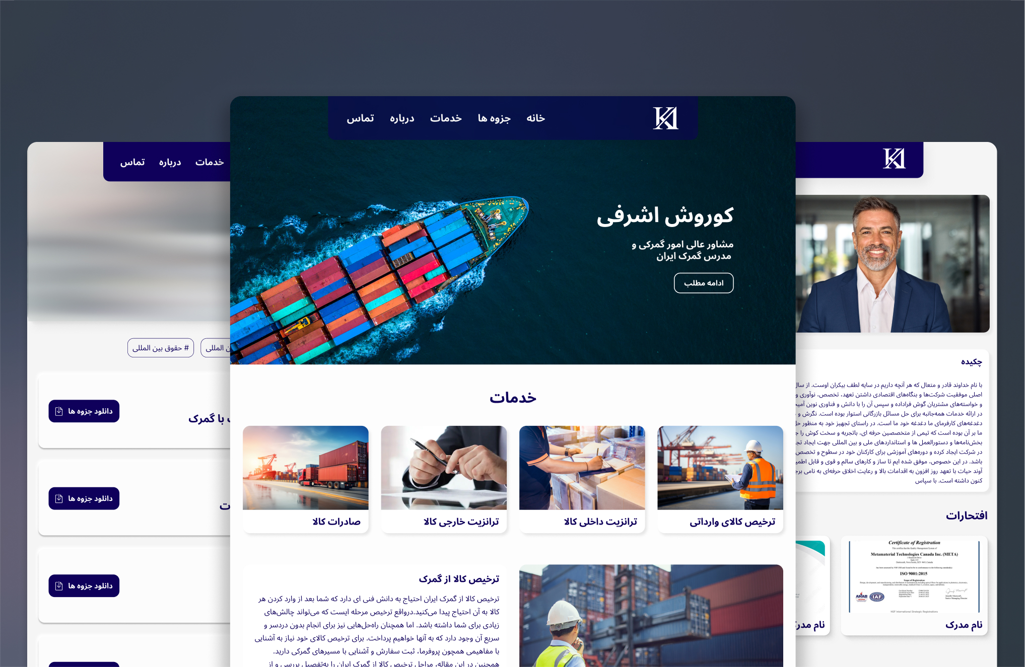
UX-UI . Developement
A Professional website for a Customs Consultant
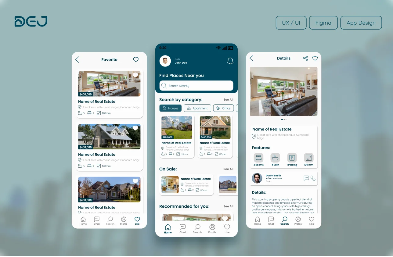
UX-UI . App Design
User center real estate app design focused on smooth user flow and interaction.