Bisou Website Redesign
Project Overview
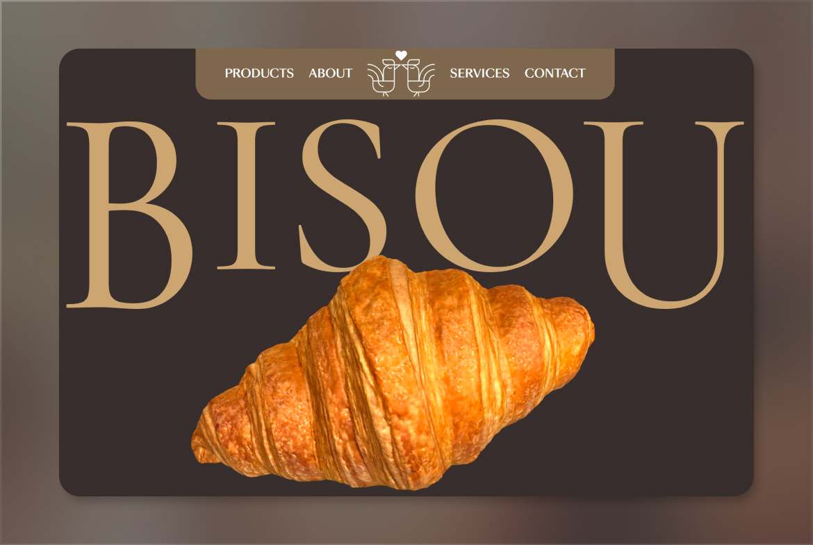
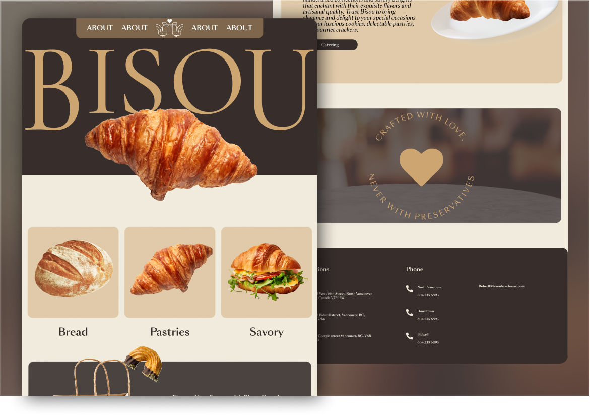
We were given the opportunity to redesign Bisou's website to reflect the bakery's superb quality and premium level. Through research, stakeholder meetings, and user studies, we designed an interactive website with animations to provide a unique user experience. The central element of the design is Bisou's iconic croissant, which guides users and facilitates storytelling through animations and interactions.
Technologies Used:
Figma
Webflow
Spline
GSAP
KIRI Engine
Blender
adobe creative suite
Asana
Members and Role:
Kimia Ahrafi
- Developer
- UX-UI Designer

Amir reza Sadeghi
- Developer

Amir kian Ashrafi
- Project manager
Problem Statement:
The existing Bisou website was cluttered, provided a poor user experience, and had outdated design elements and dead-end links. It failed to represent the premium quality of Bisou's offerings.
Solution Statement:
I proposed an interactive website with engaging animations to enhance user experience and storytelling. The design would center around Bisou's signature croissant, guiding users and creating a unique journey.
Work Process
My work process for redesigning Bisou's website focused on creating an engaging, user-friendly experience that reflects Bisou's premium quality. I conducted thorough research, collaborated closely with stakeholders, and iterated on designs based on feedback to achieve the final product.
- Analyzing Existing Website
- Competitive Analysis (SWOT)
- Stakeholder Meetings
- Creating User Personas
- User Scenarios
- Empathy Maps
- Journey Maps
- Low-Fidelity Wireframes
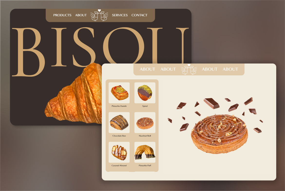
- High-Fidelity Designs
- Photography & Image Editing
- 3D Scanning and Rendering
- Webflow Development
- Spline Integration
- GSAP Animations
- Responsiveness
Research
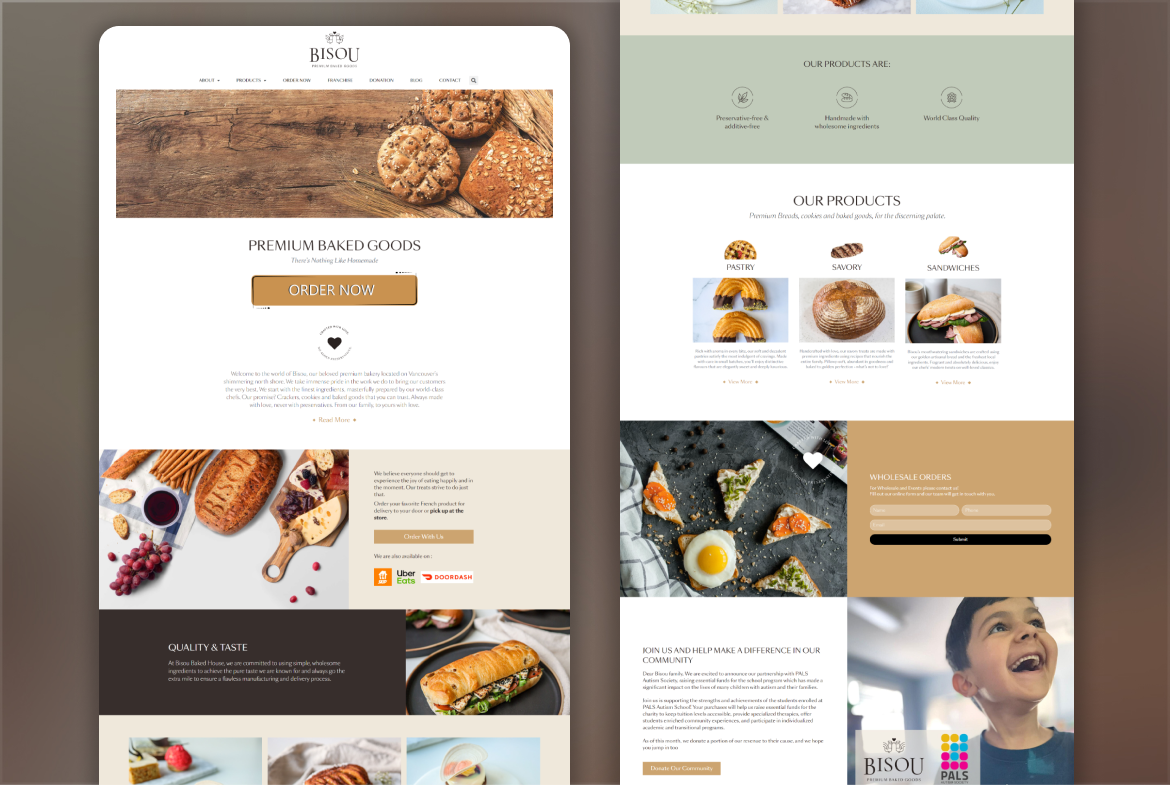
We began by analyzing Bisou's existing website. It was cluttered, difficult to navigate, and filled with outdated design elements and dead-end links. This highlighted the need for a complete overhaul to create a smooth, engaging user experience.
Competitive Analysis
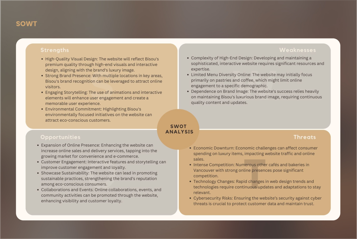
Next, We conducted a competitive analysis using a SWOT framework to understand what competitors were doing well and identify market gaps. This helped define opportunities for Bisou's new website.
Stakeholder Meetings
Meeting with stakeholders was a crucial part of the research. However, the lack of a product owner familiar with design and development standards made it challenging to align their ideas with user-centered design practices. Through multiple discussions, I managed to bridge this gap and align their vision with practical design and development practices.
Challenges:
Stakeholders' unfamiliarity with design and development standards, requiring extra effort to guide and align their ideas.
User Analysis
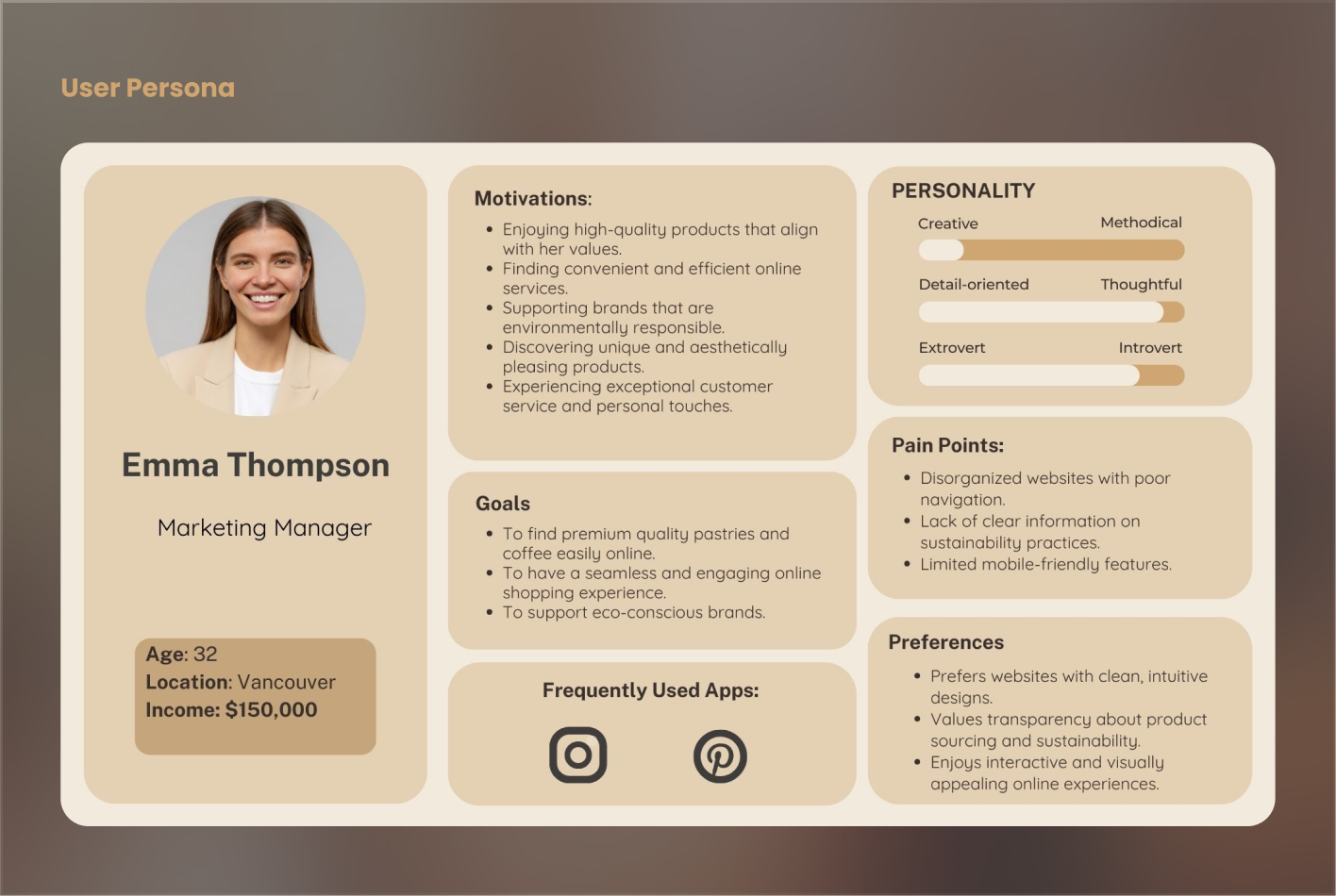
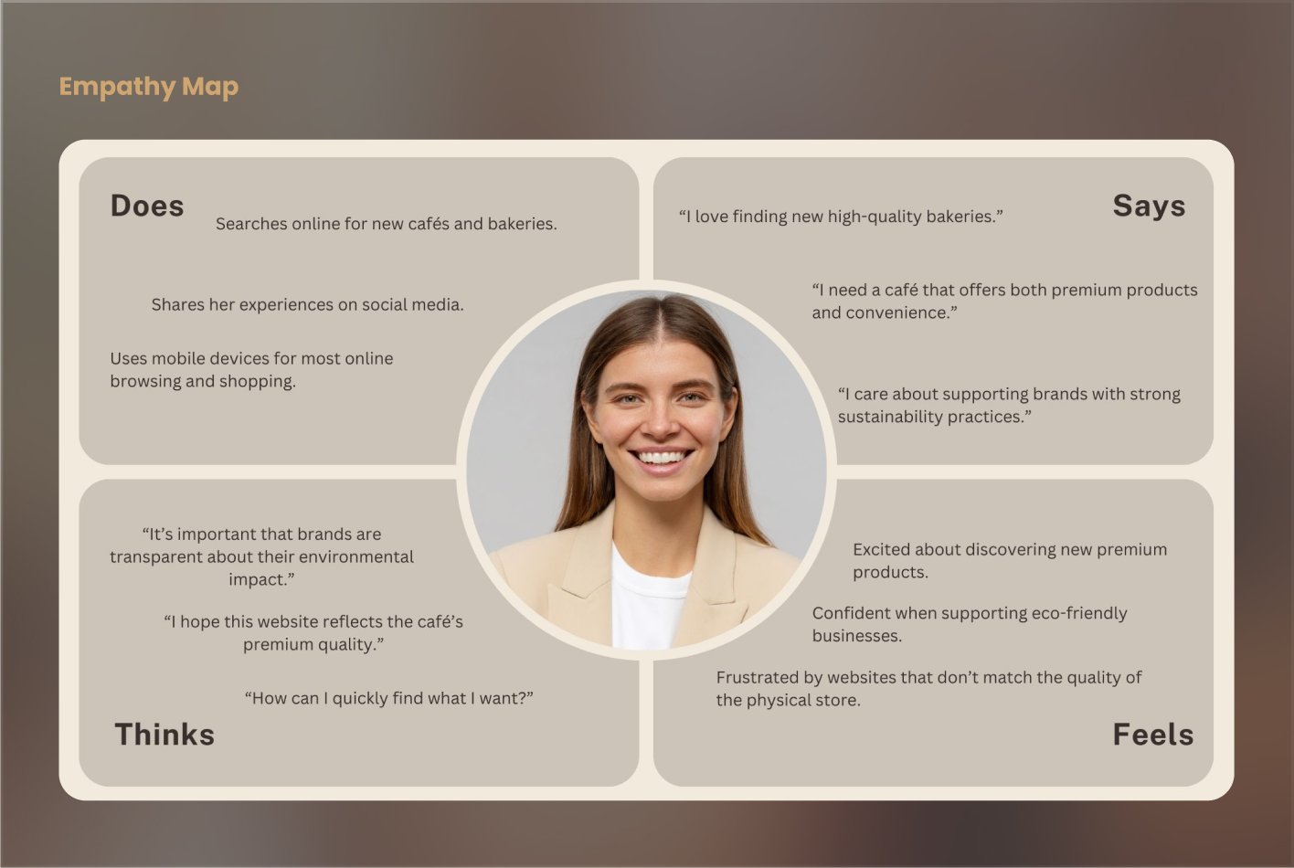
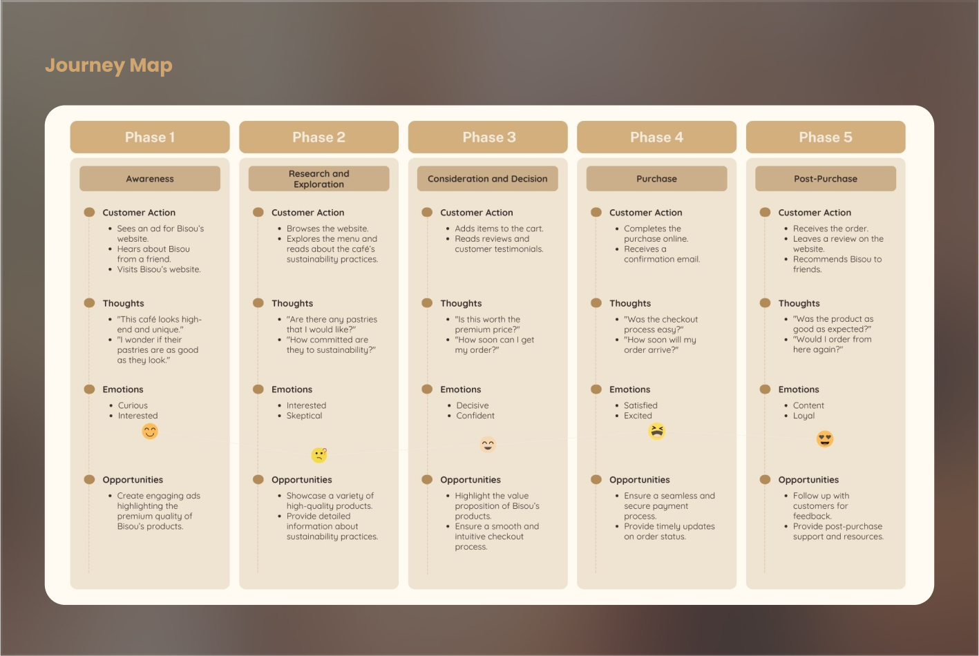
With a clear understanding of the current site’s issues and market needs, I moved on to brainstorming. I created user personas, empathy maps, and journey maps to deeply understand our users. This groundwork informed my design decisions.
Low-Fidelity Wireframes
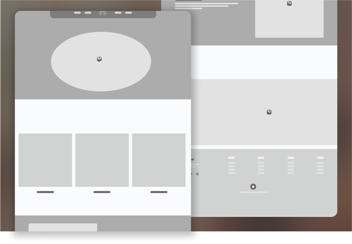
I started with rough sketches and low-fidelity wireframes, iterating based on feedback. The main challenge was ensuring these designs communicated the vision to stakeholders unfamiliar with design principles.
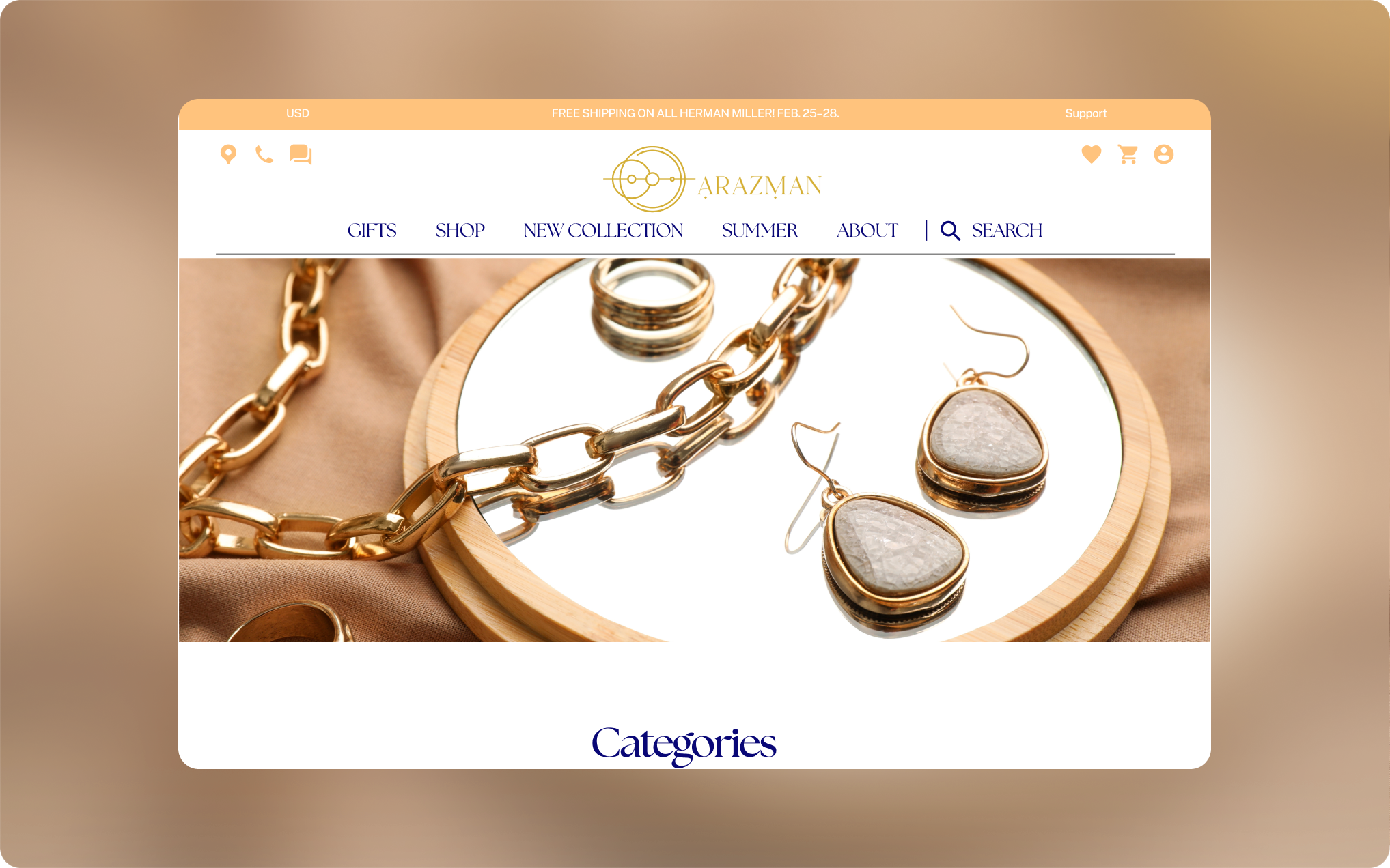
High-Fidelity Designs
3D Scanning and Rendering
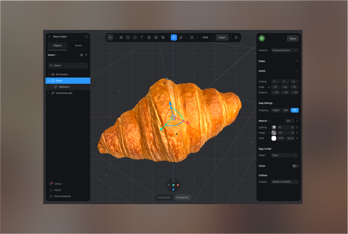
To add interactivity, I decided to integrate a 3D model of Bisou's famous croissant. This involved learning to scan, render, and edit a 3D object using Kirin, Blender, and Spline. Optimizing these assets to prevent the website from becoming too heavy was a key challenge.

Challenges:
Finding the best tools and technologies for high-fidelity designs.
Organizing a photoshoot and editing images to convey premium quality.
Learning and optimizing 3D scanning, rendering, and editing to ensure a smooth user experience.
Webflow
I chose Webflow for its robust features and seamless interactivity. This was my first project using Webflow, so there was a steep learning curve. However, its possibilities made it worth the effort.
Spline
To implement the 3D croissant, I used Spline. Making the 3D model responsive was challenging due to Spline's height-based responsiveness, which didn’t align with Webflow's width-based responsiveness. This required extensive research and community engagement to resolve.
GSAP and Animation
I turned to GSAP for advanced animations, which required connecting with talented members of the GSAP and Webflow communities. Their insights were crucial in achieving the desired effects and integrating GSAP with Webflow.
Responsiveness
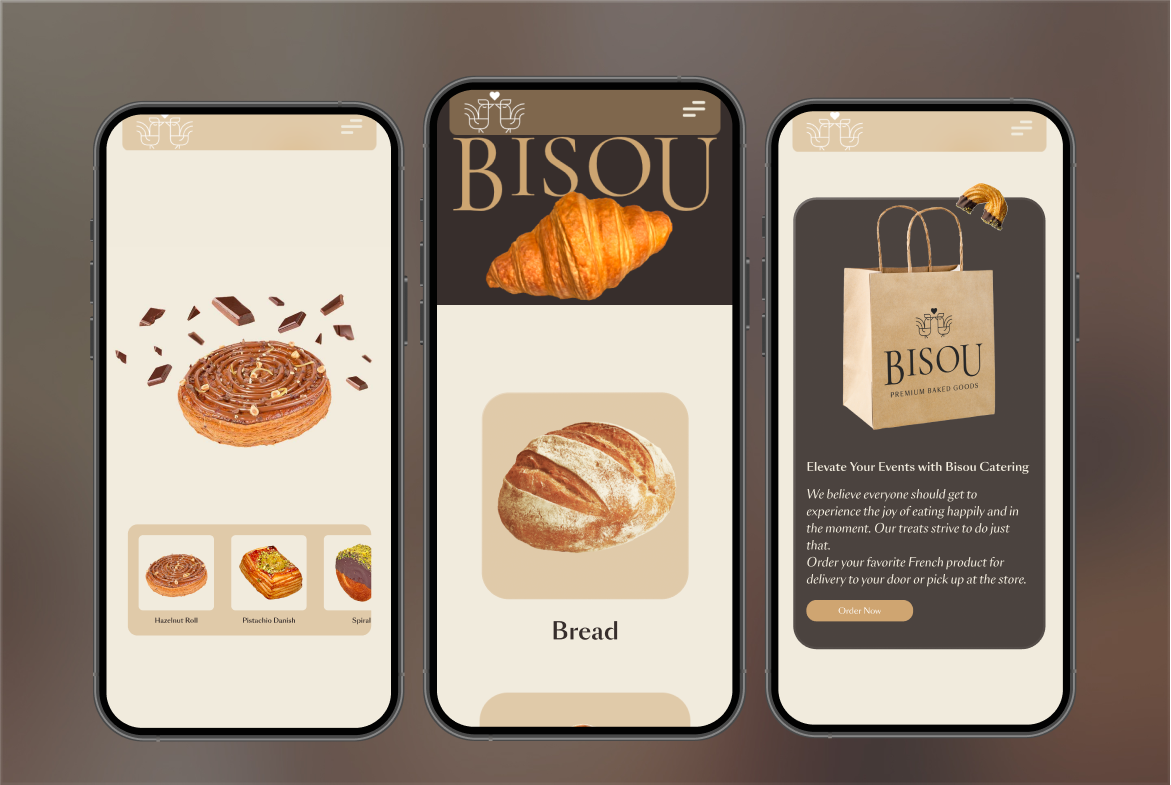
Ensuring the site was mobile-friendly and responsive was crucial. Balancing Spline’s and Webflow’s differing responsiveness methods without sacrificing design and animations was a significant milestone.
Debugging
Once the MVP was ready, We rigorously tested it on multiple platforms and devices, resolving high-priority bugs to ensure a smooth user experience.

Challenges:
Learning curve associated with Webflow.
Spline's height-based responsiveness clashing with Webflow's width-based responsiveness.
Learning GSAP and integrating it with Webflow.
Combining Spline's and Webflow's responsiveness methods.
Identifying and fixing bugs across different platforms and devices.
Overcoming these challenges involved extensive self-learning, community engagement, and trial-and-error. I joined Webflow,Spline and GSAP communities, watched tutorials, and experimented with the platform until I became proficient.
Conclusion
This project has been one of my favorites. It presented numerous challenges and learning opportunities, requiring innovative problem-solving. I connected with talented designers and developers, which was a fantastic experience.
Working on Bisou's website felt like solving a complex puzzle, and I love puzzles. It pushed me to learn new tools, think outside the box, and meet amazing people along the way. Even though we have more work ahead to reach the final product, the journey so far has been incredibly rewarding. I'm really proud of the progress we've made and excited about further development.
