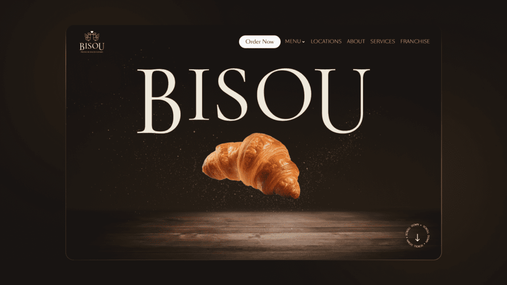
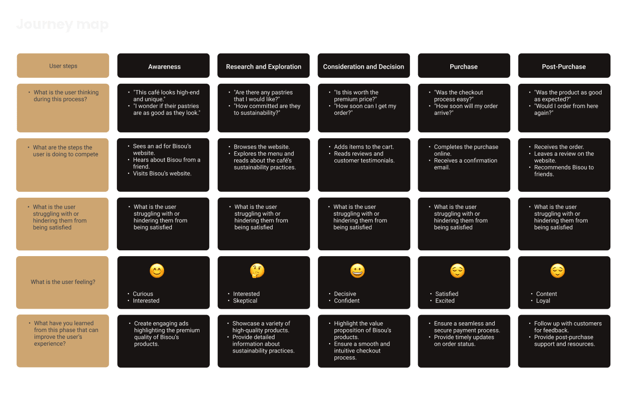
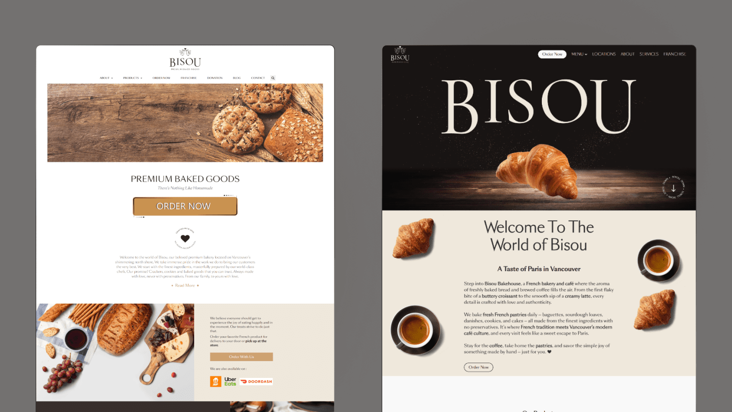
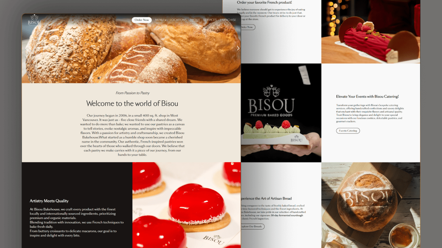
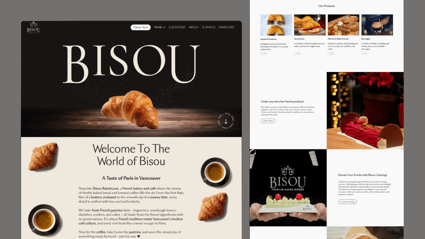
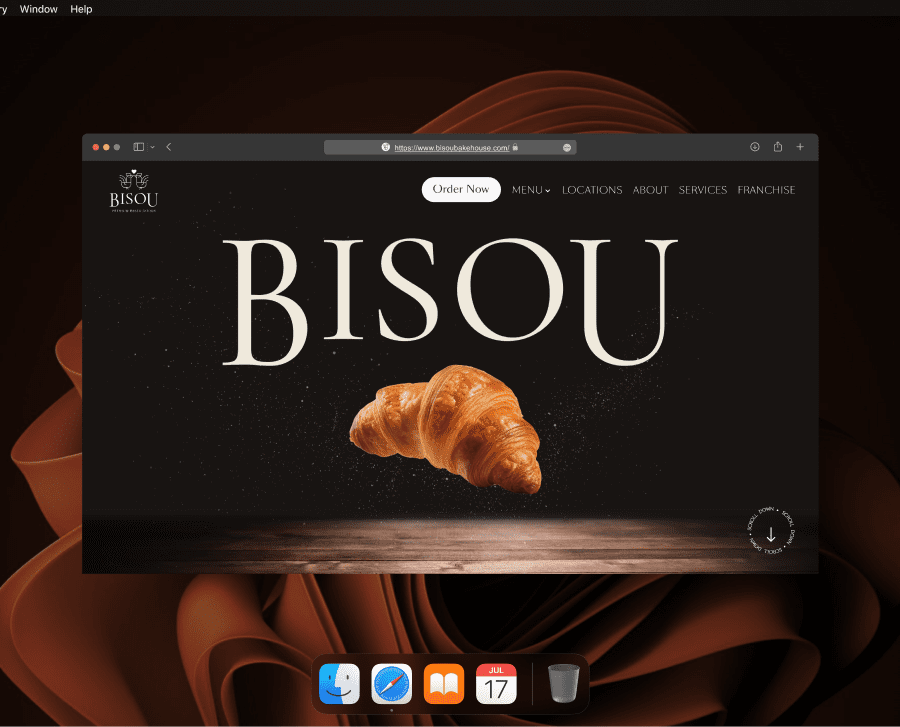
Bisou Bakehouse

Project Overview

Bisou Bakehouse is a premium French bakery and café in Vancouver known for handcrafted pastries, breads, desserts, and specialty drinks. As the business grew, the website needed to do more than present information. It needed to communicate quality more clearly, strengthen trust, and support larger business goals such as catering growth and franchise interest.

This redesign focused on creating a more polished and strategic digital experience that better reflected the in-store brand, improved browsing across desktop and mobile, and introduced clearer pathways for customers, corporate clients, and potential franchise partners. Alongside the visual redesign, the website structure and supporting content were shaped to increase visibility and make the site work as a stronger conversion tool.

Tools / Skills:
  • Figma
  • Webflow
  • Photoshop
  • Illustrator
Role
  • UXX-UI
  • Web Developer
Date:
2024
Collaborator
Adrian
circle-icon 1

Problem

The previous website did not fully reflect the premium quality of the Bisou brand or support the bakery’s growth goals. While it provided basic information, it lacked the visual confidence, structure, and conversion pathways needed to build trust and guide users toward action.

Some of the main issues were:

  • The digital experience felt weaker than the in-store brand experience.

  • Product discovery was limited and less engaging than the actual offering.

  • The site was not doing enough to communicate credibility and scale.

  • Catering, wholesale, and franchise opportunities were not clearly presented.

  • The mobile experience needed to feel more intentional and easier to browse.

Bisou needed a website that felt more premium, made the brand more visible, and worked as a stronger business tool for both customers and potential partners.

circle-icon 1

Solutions

To address these issues, I redesigned the website around three main goals: improve brand trust, make the browsing experience clearer and more engaging, and create stronger conversion pathways for Bisou’s business offerings.

The new direction elevated the visual identity through stronger imagery, cleaner layout structure, and more intentional hierarchy so the website would better match the quality of the bakery itself. I also improved how the site introduced the brand, showcased products, and guided users toward higher-intent pages such as services and franchise opportunities.

Beyond the interface, the content structure was shaped to support business growth. Pages like About, Services, and Franchise were designed to communicate credibility, show the breadth of Bisou’s offerings, and encourage inquiries from both corporate clients and potential franchise partners. This made the website more than a showcase. It became a more active part of the business

circle-icon 1

Work Process

Before moving into interface design, I focused on understanding how users discover premium cafés online, what helps build trust in that experience, and where friction happens between interest and action. Since Bisou’s goals were both customer-facing and business-facing, the process needed to balance user needs with outcomes like product browsing, catering inquiries, and franchise interest.

User Persona & Empathy Map


Together, these helped define the kind of user most likely to discover and interact with Bisou online: someone visually driven, quality-conscious, and often browsing on mobile. They also highlighted what users are really looking for when visiting a bakery website — confidence in product quality, a quick understanding of what is offered, and reassurance that the business feels trustworthy. This made it clear that the website needed stronger visuals, clearer content hierarchy, and a more intentional brand presence from the first impression.

Journey Map

The journey map showed that the website had to do more than display products. It needed to support a full path from discovery to consideration to action. That meant improving the first impression, reducing friction in browsing, and creating clearer pathways for users who were exploring Bisou for catering, wholesale, or franchise opportunities.
circle-icon 1

Design Exploration

Once the main friction points were clear, I moved into structure and layout exploration. The goal at this stage was to improve hierarchy first, then translate that structure into a more refined and premium interface.

Early Homepage Wireframe

The low-fidelity wireframe focused on content order, navigation flow, and how to better introduce Bisou’s products and brand story. At this stage, the priority was not visual styling but making sure the page supported both discovery and trust-building.

From Low-Fidelity to High-Fidelity

This transition shows how the structure evolved into a more polished and brand-aligned homepage. The final direction uses stronger imagery, clearer hierarchy, and a more spacious layout to create a first impression that feels more premium, while still guiding users toward products and key business offerings.
circle-icon 1

Visual Refinement

After the structure was established, the focus shifted to how the site should feel. The interface needed to look elevated and warm, communicate product quality quickly, and support trust through a more editorial and intentional visual style.

Refined Visual Direction

The final design direction used high-quality imagery, more breathing room, and clearer section grouping to better match the premium in-store experience. Instead of feeling like a basic bakery website, the redesigned interface positions Bisou as a more established and polished brand.
circle-icon 1

Responsive Mobile Experience

Since many users discover cafés and bakeries on their phones, the mobile experience was treated as a core part of the redesign. The layouts were simplified, hierarchy was tightened, and key actions were made easier to scan and access on smaller screens. The goal was to keep the premium feel of the brand while making browsing faster and more intuitive.
circle-icon 1

Screen Walkthrough

Homepage

The homepage was designed to create a stronger first impression right away. It uses more confident visuals, cleaner hierarchy, and a clearer layout to communicate Bisou’s premium identity. This screen also works as a central entry point that helps users quickly understand the brand and move toward products, ordering, or deeper exploration.
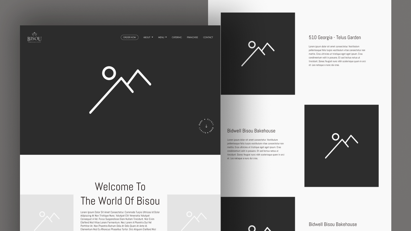
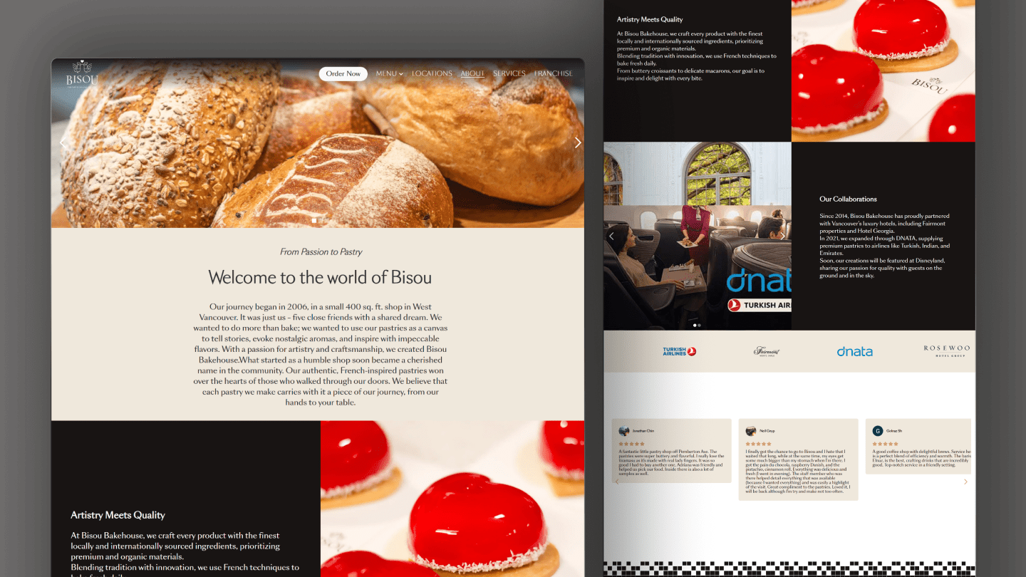
About Page

The About page was designed to build trust by giving the brand more depth and credibility. It introduces Bisou’s story, highlights its long-standing focus on quality and craftsmanship, and showcases notable collaborations such as Fairmont properties, Hotel Georgia, and airline partnerships through DNATA. Including testimonials further supports the idea that Bisou is not just visually appealing, but already trusted by both customers and respected partners.
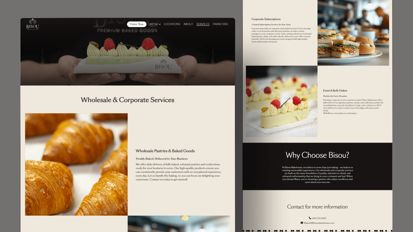
Services Page

This page expands the brand beyond the idea of a café or bakery and presents Bisou as a broader service provider. It introduces wholesale pastries, corporate subscriptions, and event or bulk orders in a way that feels more structured and business-ready. This was important because one of the project goals was to increase catering and corporate interest, so the page needed to clearly communicate what Bisou offers and why a business should trust them as a partner.
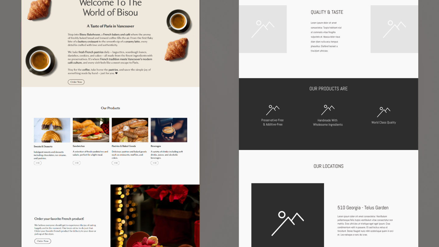
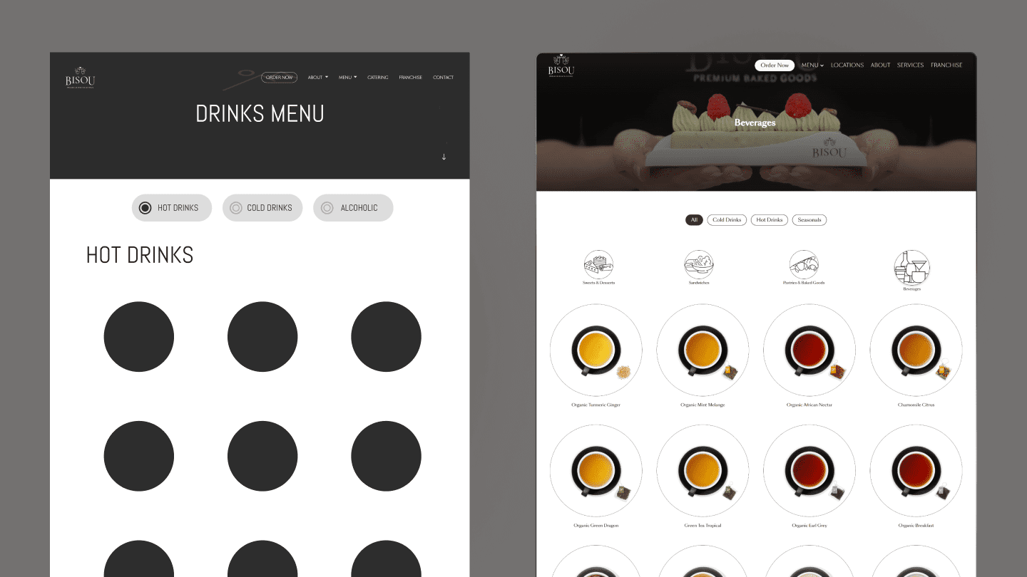
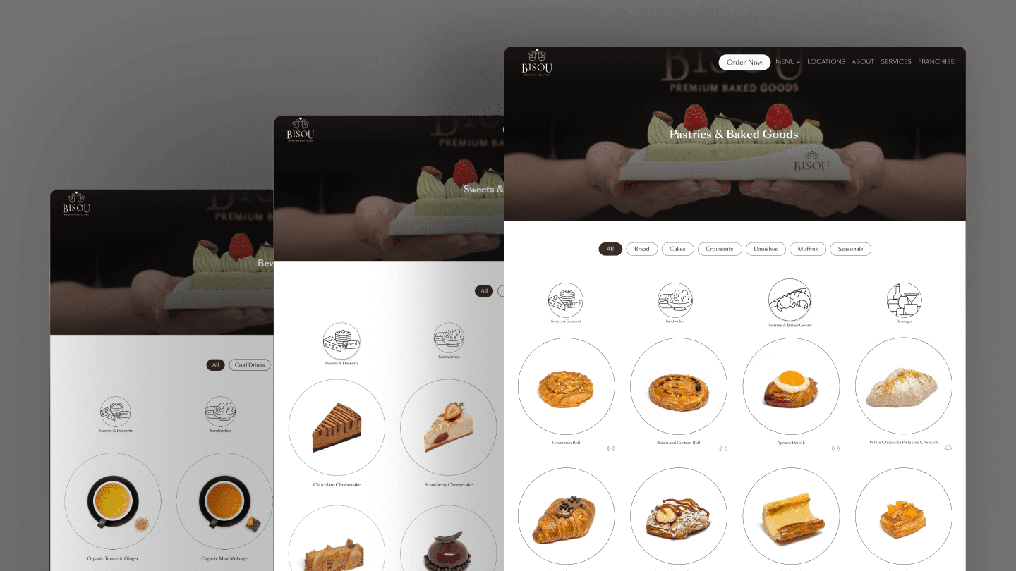
Product browsing

The product pages were redesigned to feel easier to scan and more visually satisfying. Clear categories, stronger product imagery, and a cleaner grid system help users move through the offerings more naturally. This was especially important because product discovery is one of the main parts of the customer journey.
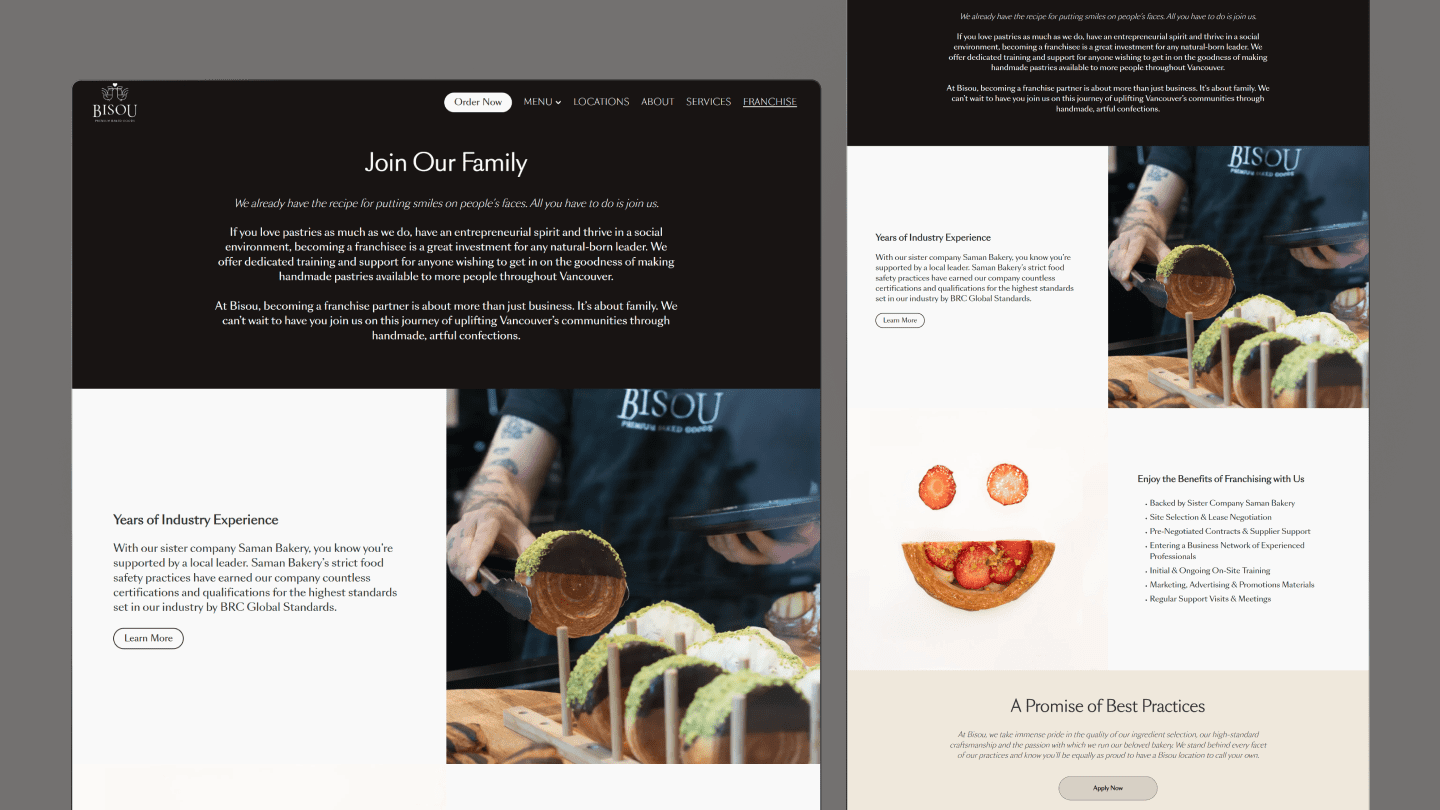
Franchise Page

The franchise page was designed to support a different kind of visitor: someone evaluating Bisou as a business opportunity. The page introduces the brand as a family-oriented franchise backed by industry experience and support systems such as training, supplier support, site selection help, and marketing materials. The content and structure were designed to make the opportunity feel more credible, more organized, and more worth inquiring about.
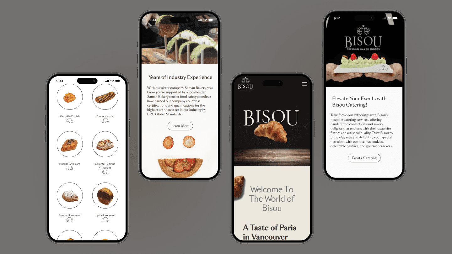
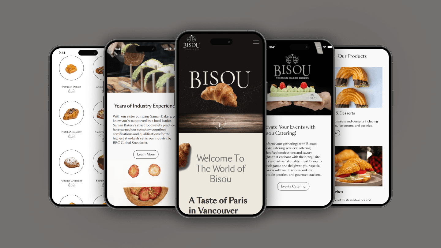
Mobile Screens

The mobile layouts focus on clarity, flow, and quick product discovery. Instead of simply shrinking the desktop design, the content was reorganized to keep the experience readable and direct on smaller screens. This was especially important because many users discover cafés, browse menus, and make decisions from mobile first.
circle-icon 1

Out come

The redesign helped turn the website into a more effective brand and business tool. By combining a more premium visual direction with clearer structure, franchise-focused content, and improved SEO support, the site became better at building trust and guiding users toward action.

The new website contributed to:

  • over 70% growth in catering activity through the website

  • Multiple franchise inquiries submitted through the site

  • stronger visibility and trust for the brand online

  • a better match between the digital experience and the quality of the actual bakery

This project showed how a redesign can go beyond aesthetics and directly support business growth when user experience, content, and business goals are aligned.

Other Projects

DevelopmentUX/UIWeb Design